Connect by T-Mobile
T-Mobile Plan and Device Purchase

The Challenge
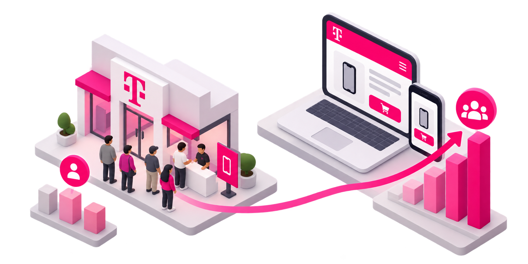
As part of T-Mobile's Digital First initiative, the company was shifting more prepaid customers from in-store transactions toward online self-service. But the existing prepaid experience wasn't built for that shift.
Opportunity
The goal…create a clearer path from plan discovery to purchase while opening prepaid to more online customers. The opportunity wasn't simply to redesign checkout it was to rethink how customers compare plans, choose a device or bring their own, add services, and confidently move toward activation.
My Role
UX Designer · T-Mobile Prepaid eCommerce
I worked across discovery, UX strategy, interaction design, responsive design, and visual design, partnering with Product, Research, Marketing, Content, Engineering, QA, and the broader Design System team.

User Research and Insights
User Research & Discovery , Product and Plan Selection
Partnering with Product, Marketing, and Engineering, I helped develop and facilitate a baseline study of T-Mobile’s prepaid experience. We uncovered confusing terminology, inconsistent labeling, and friction around finding and comparing plans.

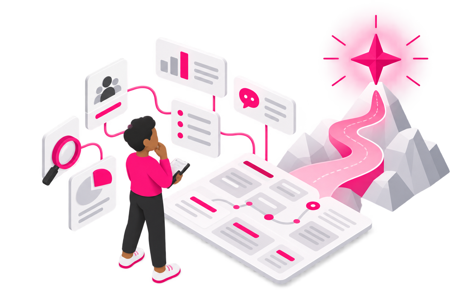
The research gave us a shared North Star, helping Product prioritize quick wins at the top of the funnel while revealing longer-term opportunities in account management, including upgrades and adding lines.
Research revealed plan discovery and understanding difficulties.
Misunderstood language and navigation led to a drop-off.
Turning customer insights into a map
Tracy represents the experienced, self-service customer who values efficiency, reliable connectivity, and staying current with technology. She expects to manage her account independently, understand exactly what she's paying for, and avoid customer service whenever possible.
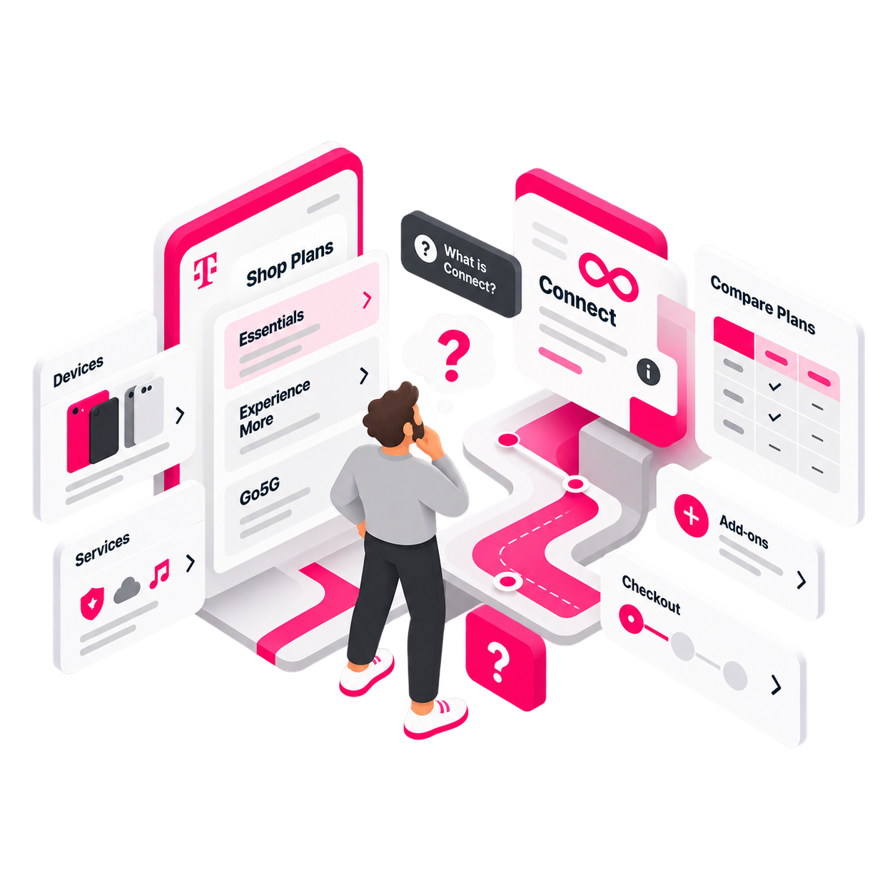
The research showed high-severity breakdowns across the purchase journey—customers struggled to discover and compare plans, understand Connect and service terminology, and maintain progress through the flow. These findings gave us clear, prioritized opportunities for improvement.
Capturing the journey and friction points
Mapping the journey helped us see where friction carried across the entire experience, from plan and device selection through checkout and account management. It also surfaced opportunities to create a more connected experience beyond the initial purchase.
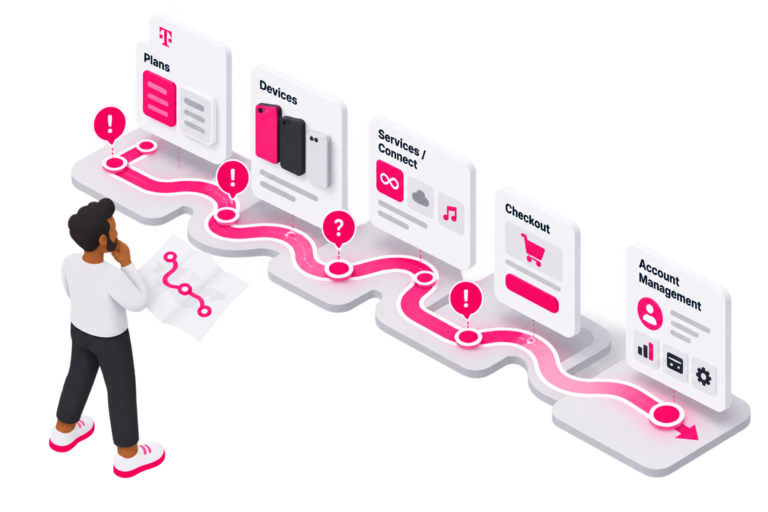
The Purchase Flow
Digging deeper into the problem
Heuristic Analysis
These sessions became more than an evaluation of the experience. They helped build a shared UX language across the team. Reviewing issues together gave stakeholders a clearer understanding of the why behind our recommendations and helped us align on which problems were worth solving.
The Product Selector created significant friction by combining plan, device, and service selection on one screen.
Users missed hidden plans, lost progress when selecting devices,
Struggled with unclear service names.
These findings pointed to a clearer opportunity: replace the dense selector with a familiar, step-by-step purchase flow.
Sketching Solutions Together
With the purchase flow defined, I used quick sketches to explore ideas and collaborate with developers early, validating technical constraints before moving into high fidelity.
I also considered both sides of the customer journey, new customers selecting a plan and existing customers changing or upgrading one and helping create a consistent experience that could scale across scenarios.
Building Alignment Around the Journey
Experience Strategy with product and owners
Once the team aligned on the core customer problems, I led the effort to visualize a new experience strategy that everyone could react to, refine, and build toward. This approach helped us quickly validate the direction before moving into detailed UI design.
Quick PIVOT
Oh By The Way, we have a new look and Feel!” - Marketing
Evolving Without Starting Over
Less than halfway through the project, a new requirement emerged: Prepaid needed to align more closely with the evolving Postpaid Design System, which was also being updated in parallel.

Style Guide & Design Systems Collaboration

Working closely with the Design System team and marketing, we reviewed available components, explored styling options, and identified gaps where Prepaid had unique needs, such as tables and accordions that weren't yet part of the shared system.
Together, we worked through those trade-offs, finding a balance between introducing the new campaign and maintaining a familiar experience.
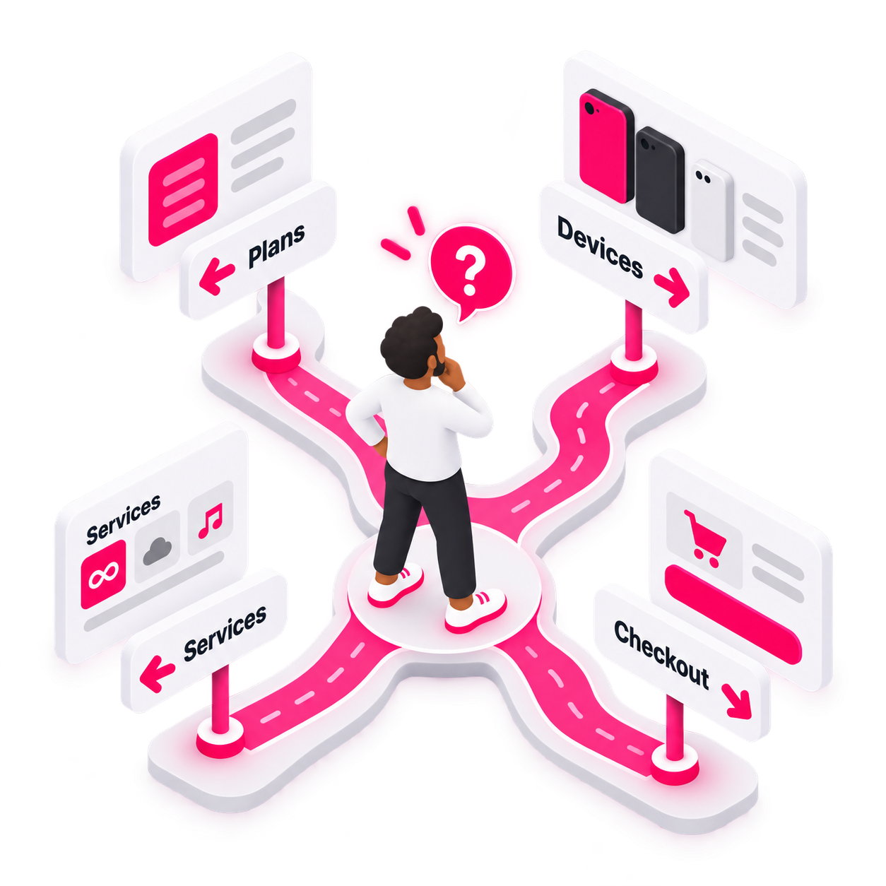
With Patterns established and the look and feel defined, we can start thinking about navigation and Wayfinding
Designing for a Nonlinear Purchase Journey
Unlike competitors with a more linear purchase path, T-Mobile customers could start with either a device or a plan. That flexibility supported different marketing campaigns, but also created more complexity within the purchase experience.
Shaping the Marketing-to-Purchase Handoff
Marketing owned the campaign landing pages, but I helped shape how customers transitioned from marketing into the purchase flow. Early concepts used a “Select Plan” CTA, even though customers couldn’t actually select a plan on the landing page.
I recommended changing it to “Shop Plan,” pairing the CTA with clear pricing and offer details. This better set expectations and created a more natural handoff from campaign messaging to the transactional experience.
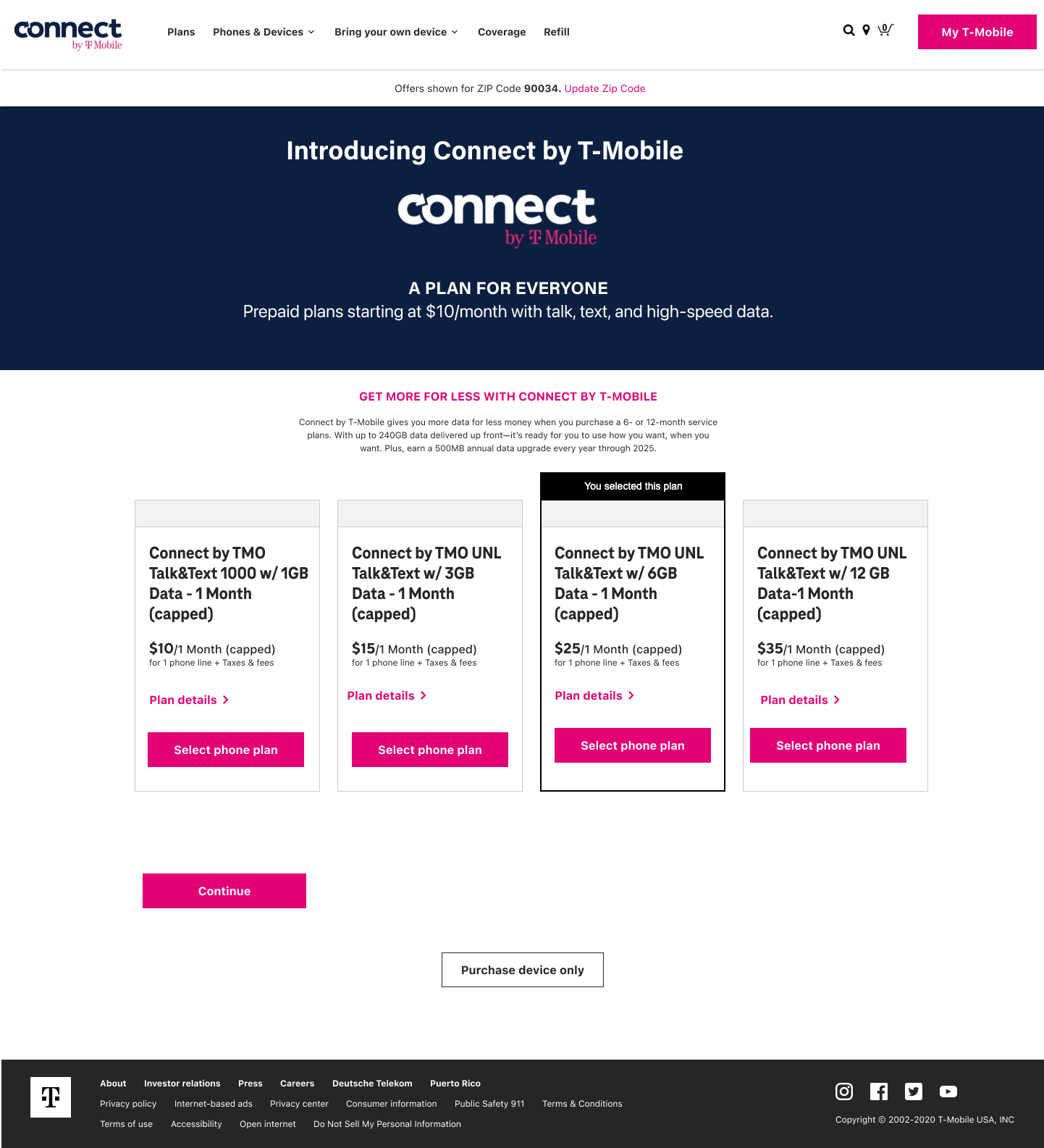
Further down the funnel, users select a plan from the new Connect campaign options
I iterated on the previous experience, where plans were buried in carousels and accordions, limiting visibility and comparison.
Plan Design Iterations
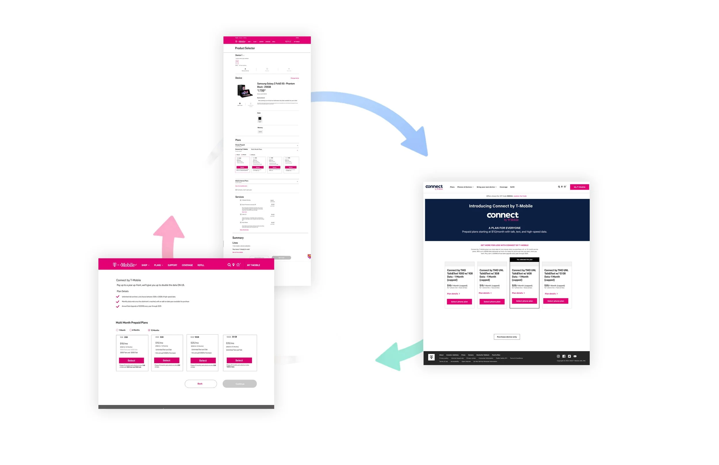
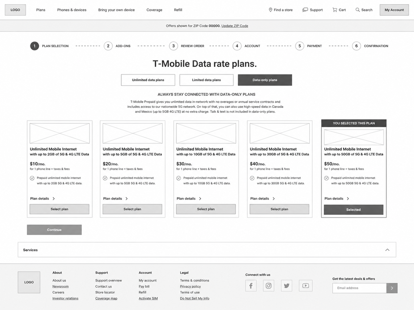
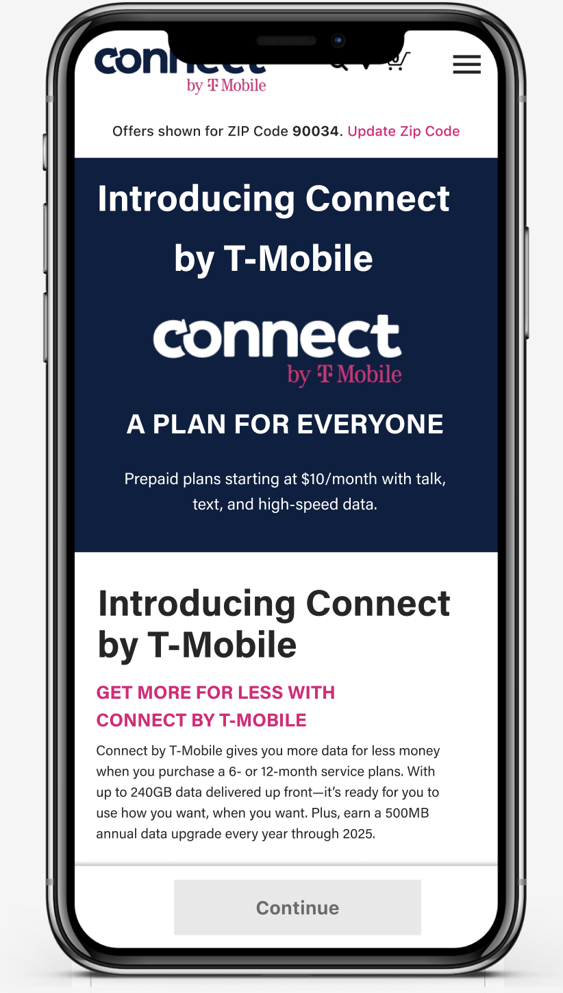
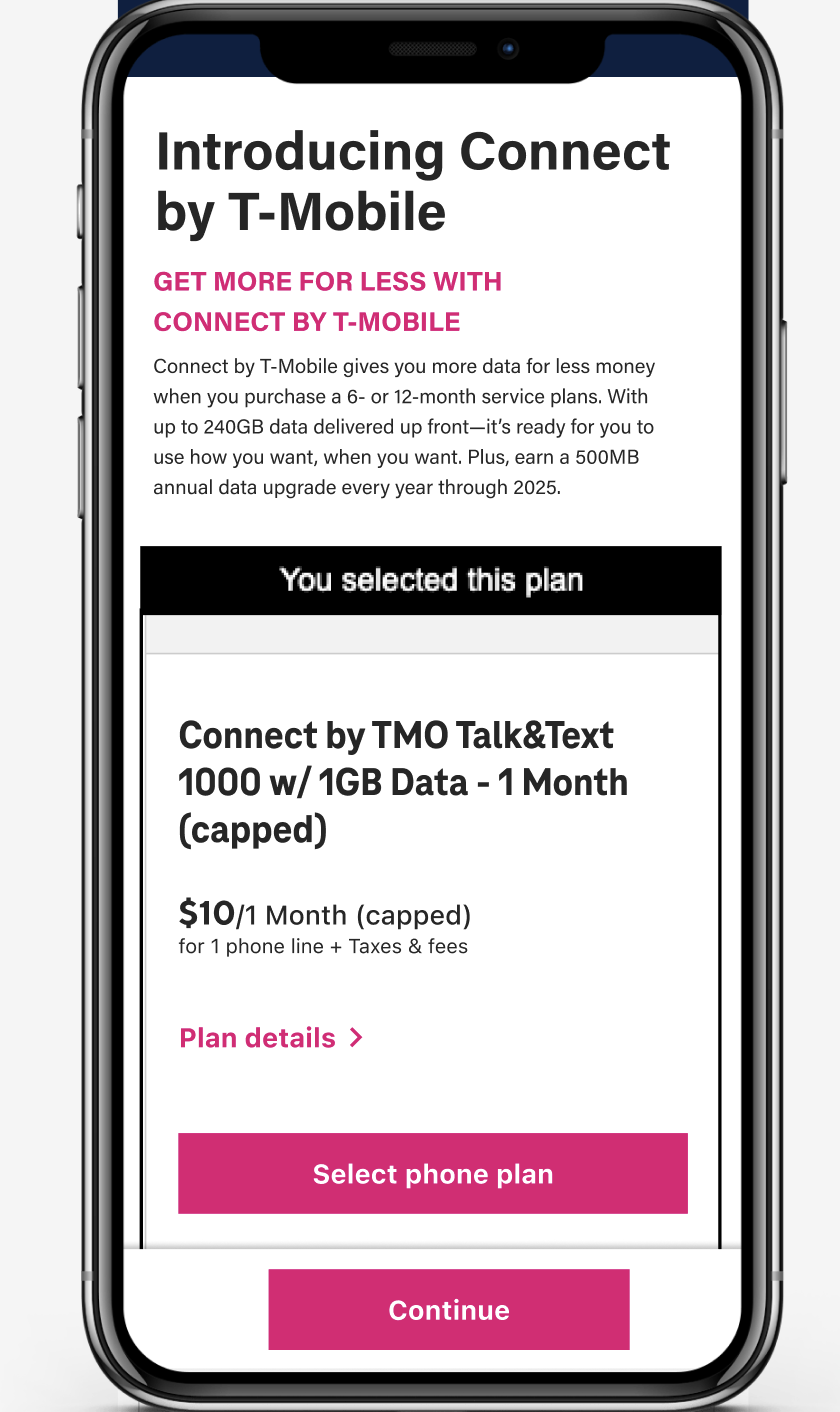
Screens had to display complex plans things like “9GB / Up front,” 1-, 6-, and 12-month options, capped data, and the Unlimited/Limited/Data-Only categories.
The UX challenge wasn't cosmetic the customer had to understand how each product actually worked before choosing.
Clarifying a Growing Plan Portfolio
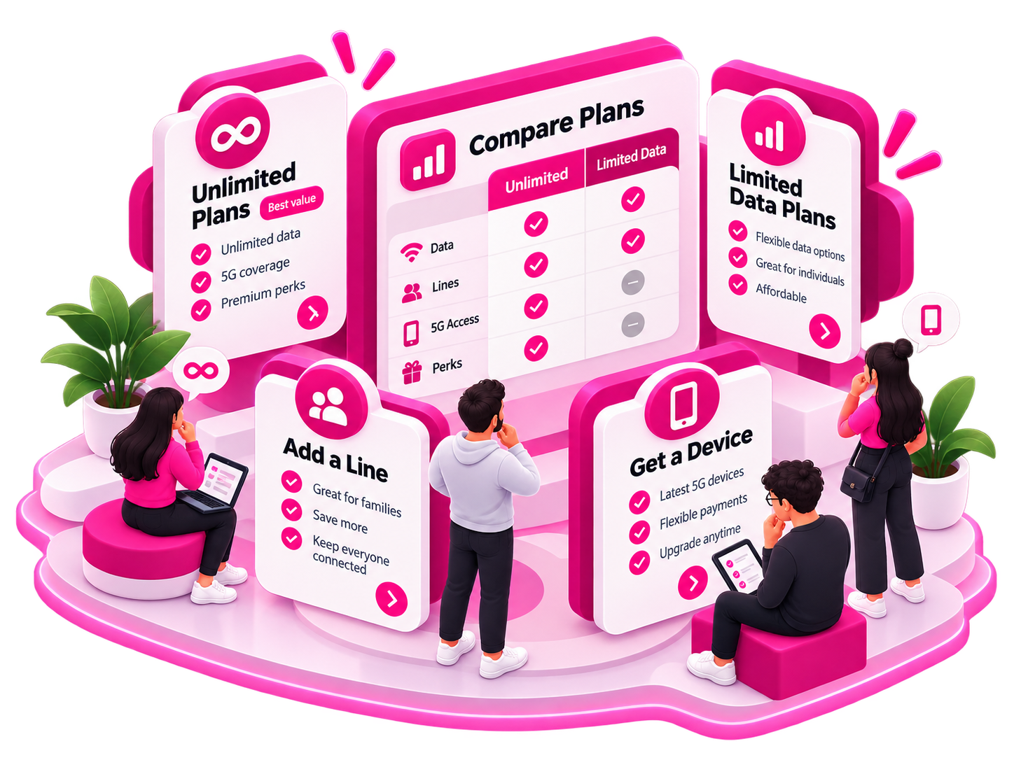
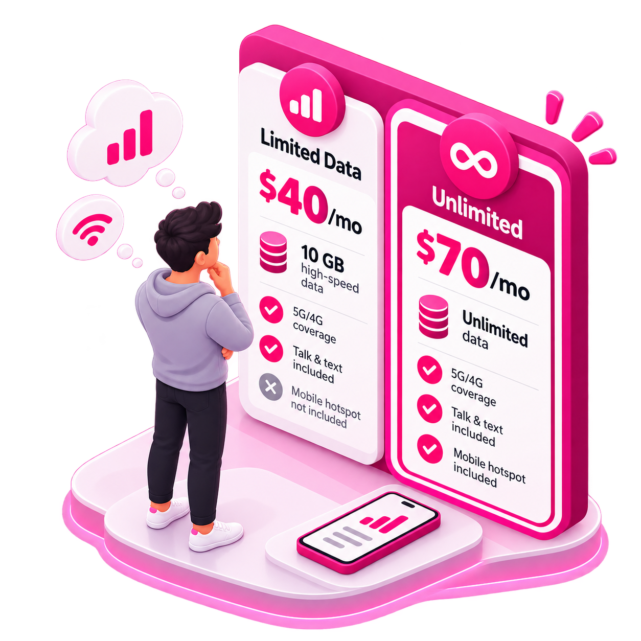
Prepaid included Unlimited, Limited, and Data-Only plans, each with different pricing, allowances, and restrictions. Research showed these customers were discerning shoppers who welcomed plan details and comparison, so simplifying couldn't mean hiding information.
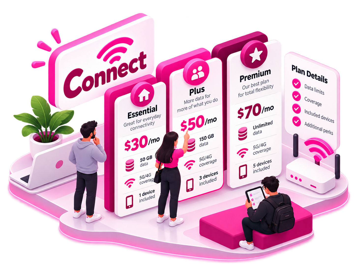
While Marketing words like Connect, alone was ambiguous to customers. we made things more descripitive plan categories, upfront pricing, data limits, and plan details keeping things clear.

Improving Device Discovery
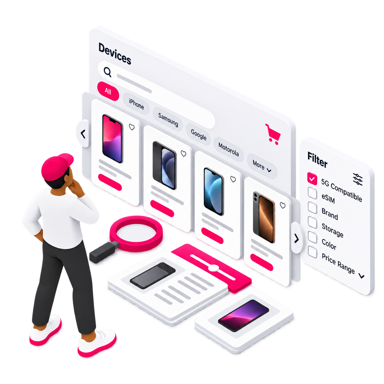
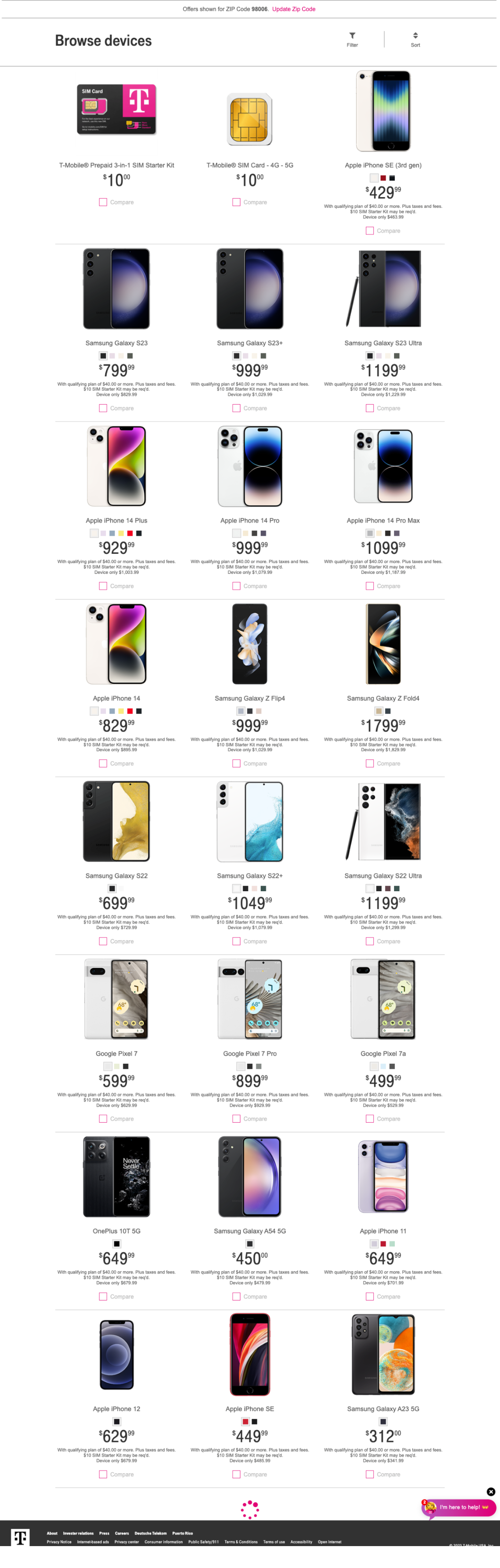
The product landing page was hard to navigate and search. I updated ZIP-code interactions, filtering, and design system patterns to improve device discovery, wayfinding, and searchability.
Product Landing Page Iterations

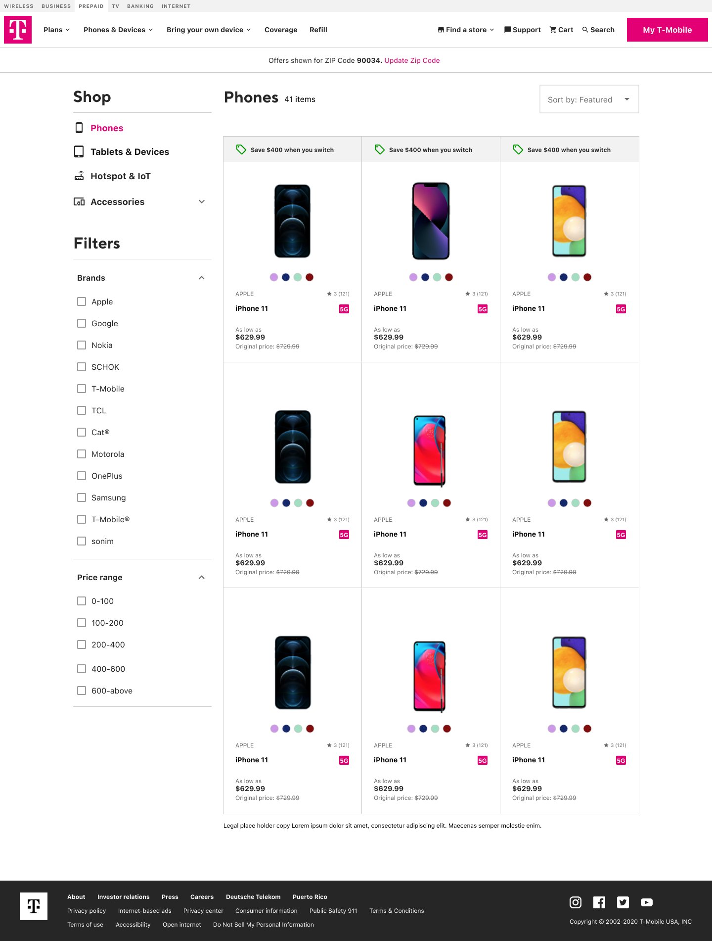
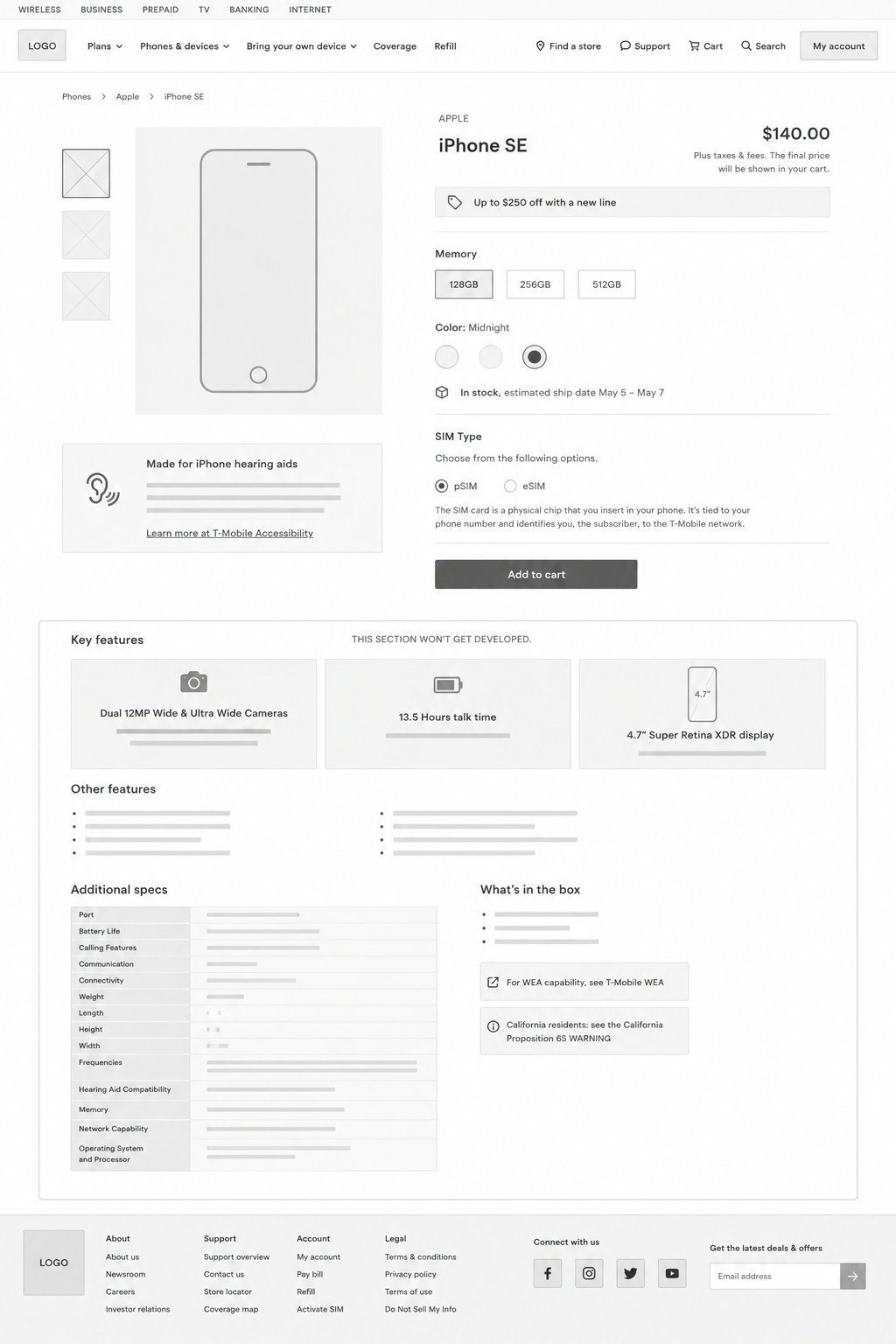
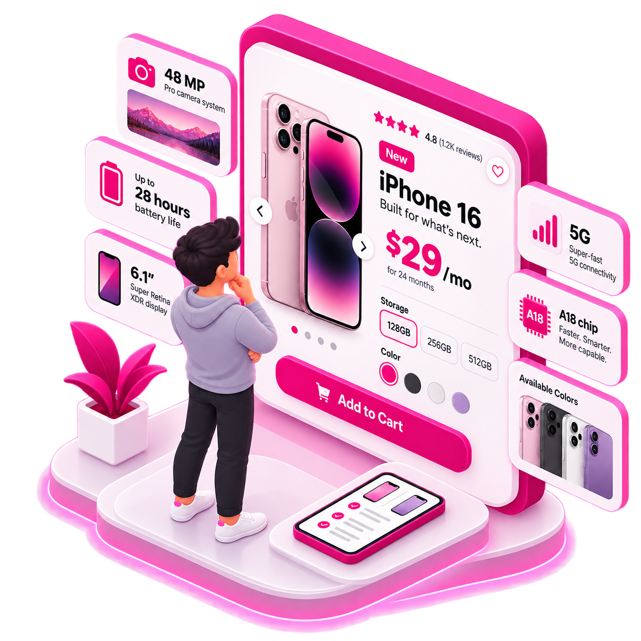
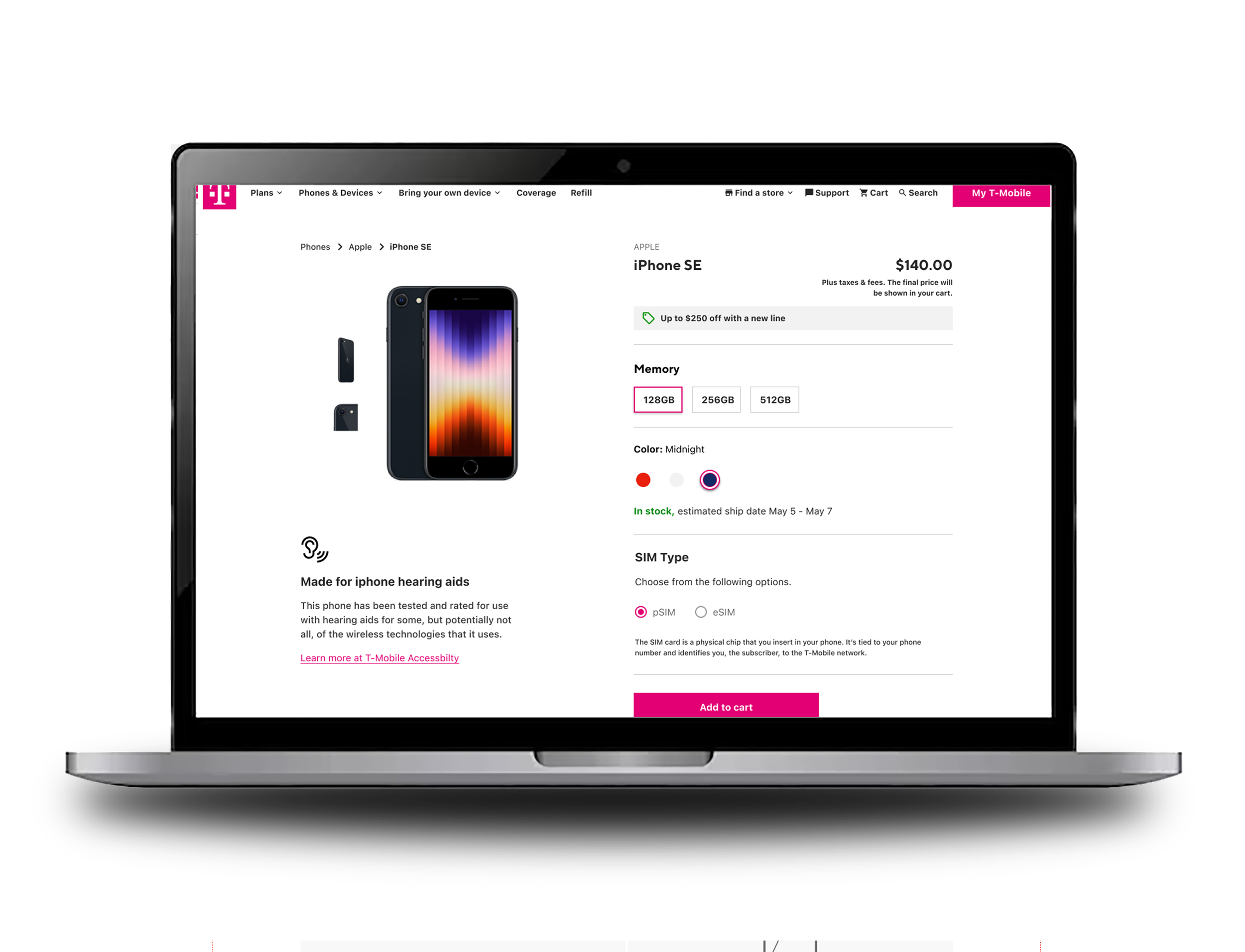
The previous PDP was dense and hard to scan. I refocused the hierarchy around the purchase decision, prioritizing price, availability, and configuration while moving supporting details down the page.
The result: a guided commerce experience, not a specification sheet.
Simplifying the Product Detail Experience
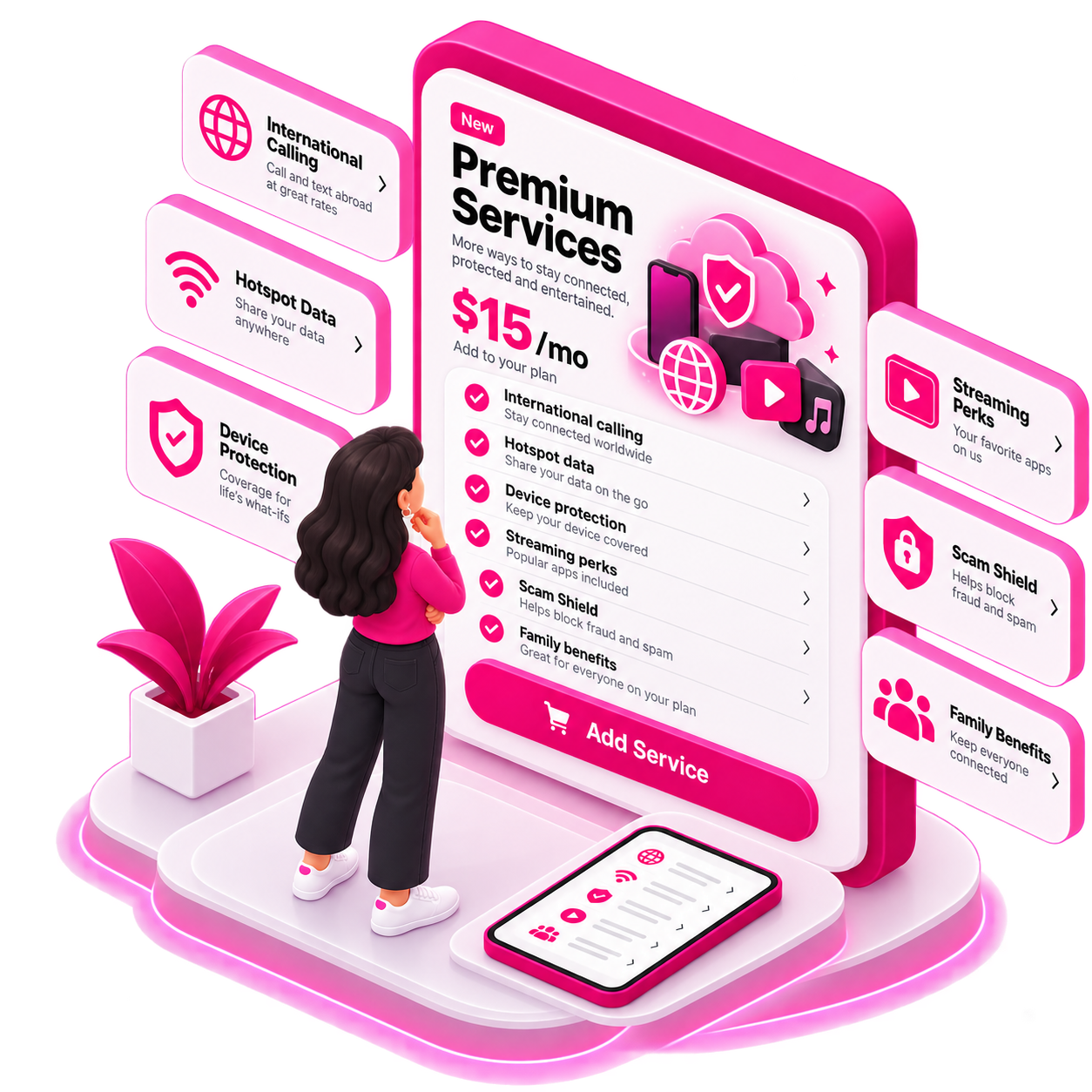
Services were buried and hard to understand. I reorganized add-ons into clear categories like International Services, Call Protection, and Security, with clearer descriptions to help customers understand their value before adding them.
Making Services Easier to Understand
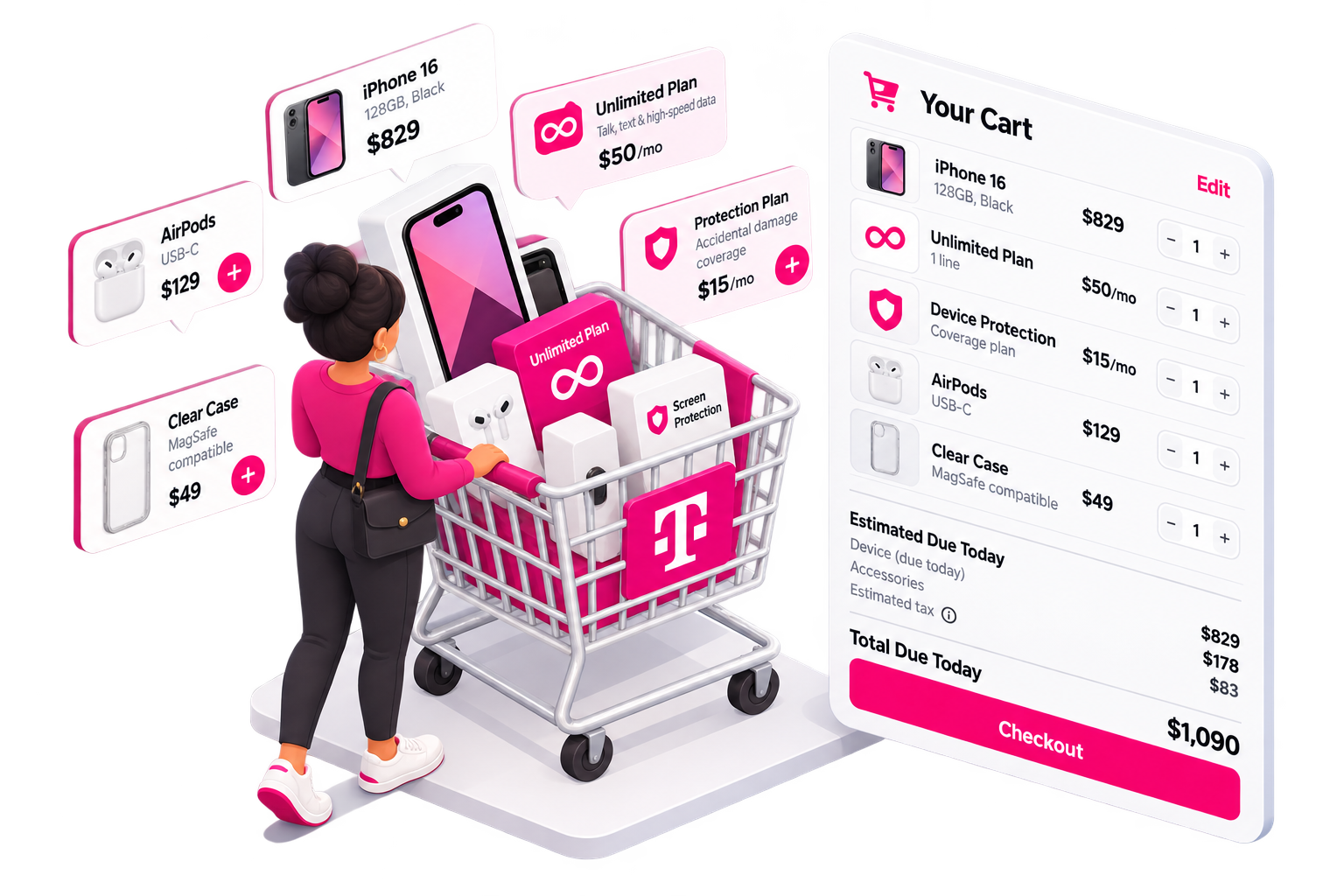
The old cart used a long, line-by-line layout with a dense pricing, making purchases difficult to review.
I redesigned it to group each device, plan, and add-on together, so customers could quickly understand what they selected and what they would pay.
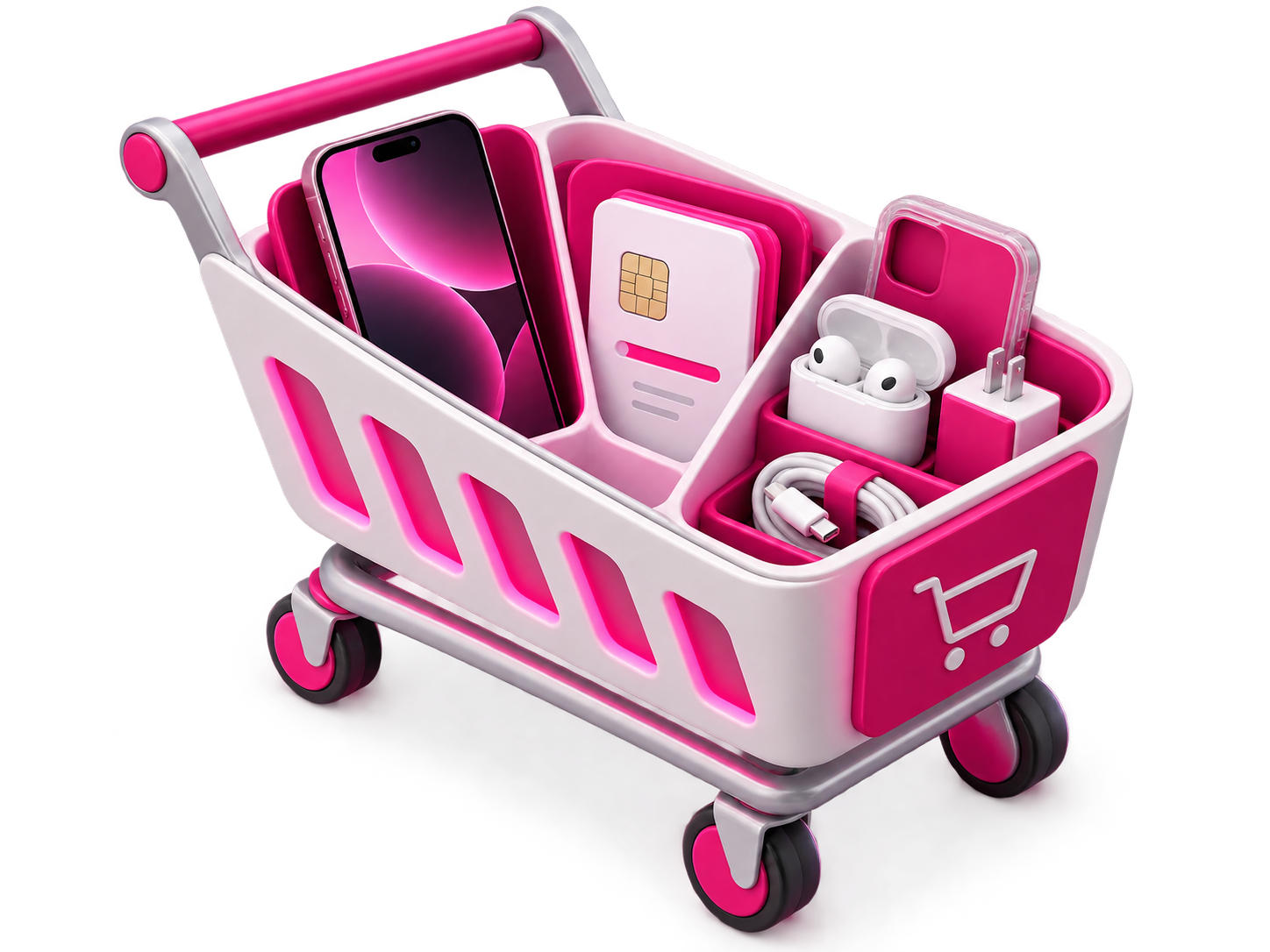
The cart also became a stronger decision point, with clearer paths to change plans, manage services, add devices, and distinguish today’s charges from monthly costs.
I used Maze to put the new direction under some pressure and see where our assumptions held up.
Working with our researcher, I helped shape scenarios around default plan selection, the meaning of “Connect,” and how pricing influenced decisions. We watched where users went first, what they ignored, and how strongly visual emphasis pulled their attention.
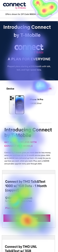
The results gave us something better than opinions: evidence. Some decisions held up. Others needed work. We used those findings to tighten the experience before it reached development.

Account Management Dashboard
Problem
Important information and actions were fragmented, while alerts often failed to clearly tell customers what was happening or what to do next.
What I Changed
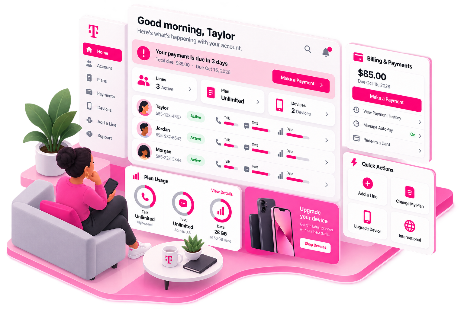
I redesigned the account dashboard around status, next payment, and high-priority actions,
Clearer paths for payments, plan changes, upgrades, and adding lines.
Introduced new alert and messaging patterns to communicate prepaid-specific states and edge cases.
Impact
Transformed the dashboard from a passive account summary into a self-service hub, giving customers clearer visibility into their account while creating natural opportunities for retention, upgrades, AutoPay, and additional lines.
UX Audit
The Take Away
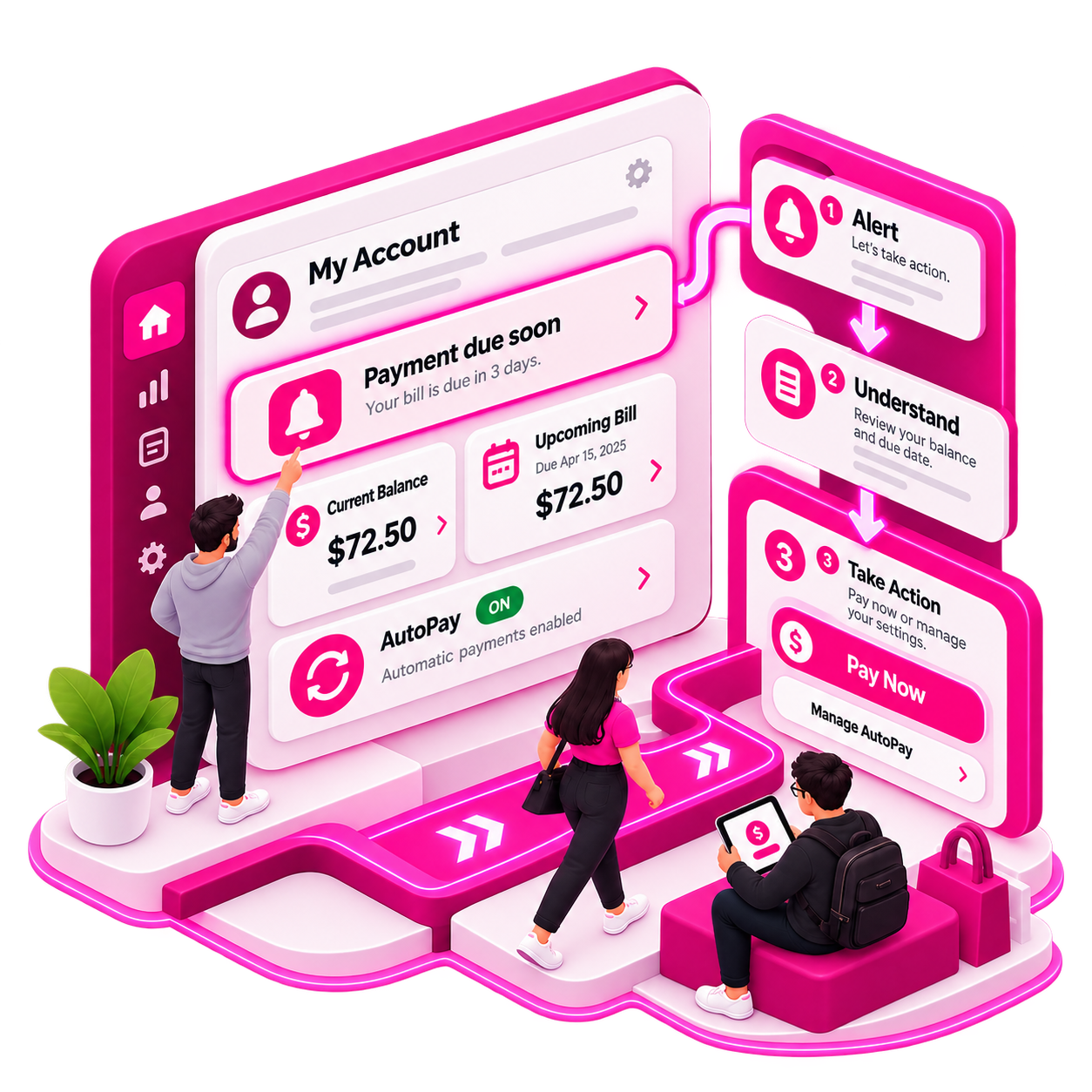
The right information is there, but didn’t clearly connect account status to the next action.
The opportunity was to make alerts, balances, payments, and AutoPay work together, helping customers quickly understand what’s happening, what it means, and what to do next.
Connecting Account Management to the Purchase Flow
(Add a line, upgrade, more services)
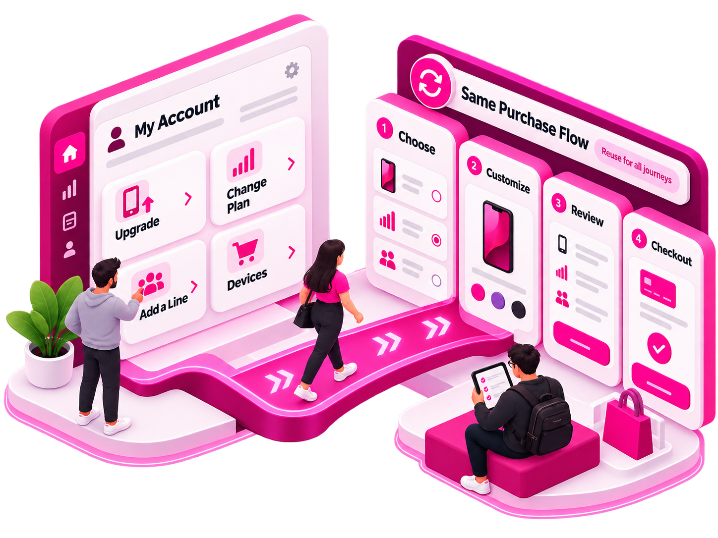
Rather than creating separate account-management journeys, I leveraged the new purchase flow for upgrades, plan changes, adding lines, and devices. This reused familiar patterns, reduced duplicate experiences, and created a more consistent path from managing an account to making a purchase.
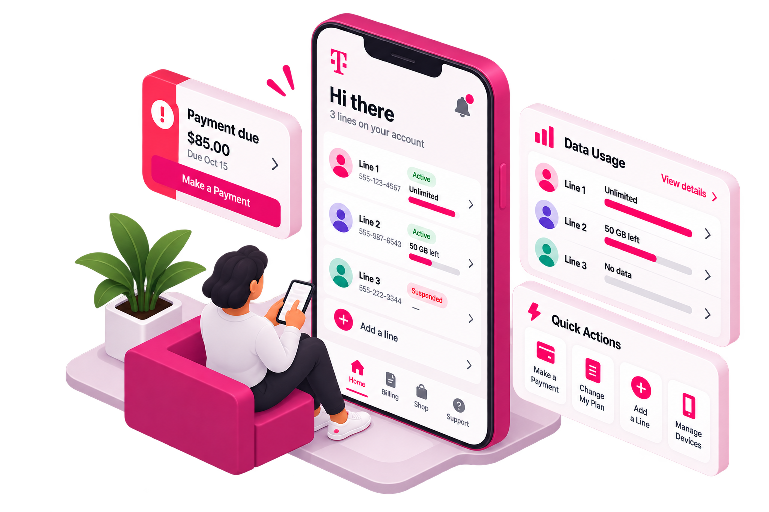
Account Management supports multiple lines and their statuses, allowing for scannability.
Surfacing Account Status Across Multiple Lines
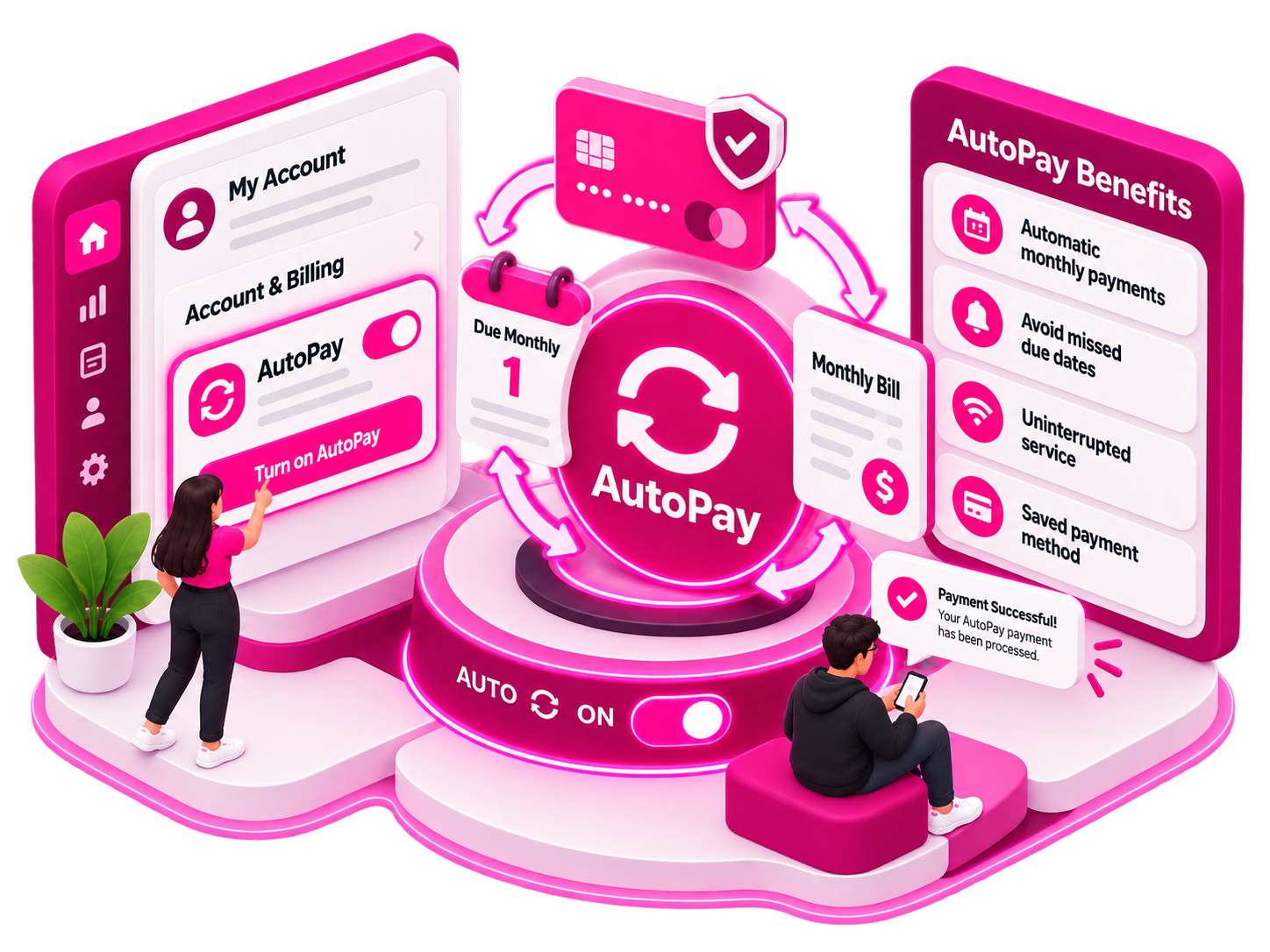
The layout encouraged users to take action, surfacing key account tools and creating a natural path to enroll in AutoPay and simplify future payments.
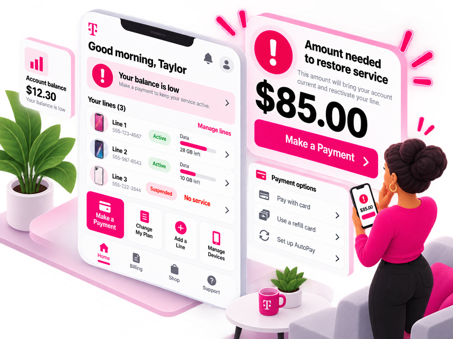
Calculating the Next Account Action
The dashboard calculated the exact amount needed to restore the account balance at that moment, removing the guesswork from prepaid payments.
The new dashboard also needed to extend seamlessly into the native T-Life app, adapting the account experience to T-Mobile’s mobile UI patterns and design system.
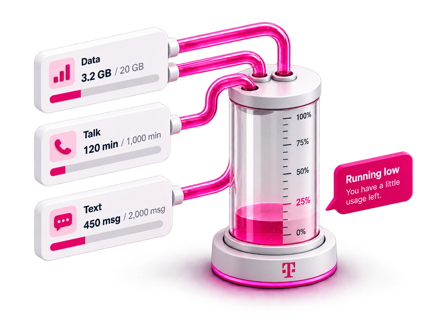
Users now receive clear data visualizations for Talk, Text, and High-Speed Data on each line, making usage and remaining allowances easier to understand at a glance.
Visualizing Usage

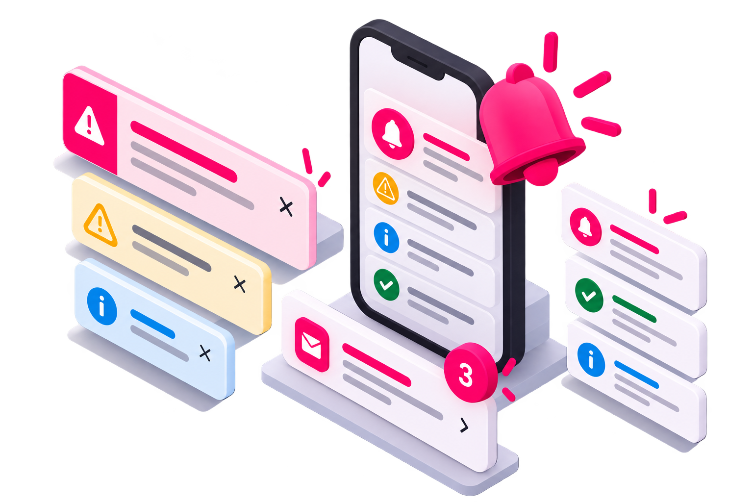
Emails and warning alerts kept customers informed about overdue payments, successful payments, and potential cancellations, clearly communicating the actions needed to prevent service suspension or restore an account.
Responding to Account Statuses
Part 3 Account Payments and Refills
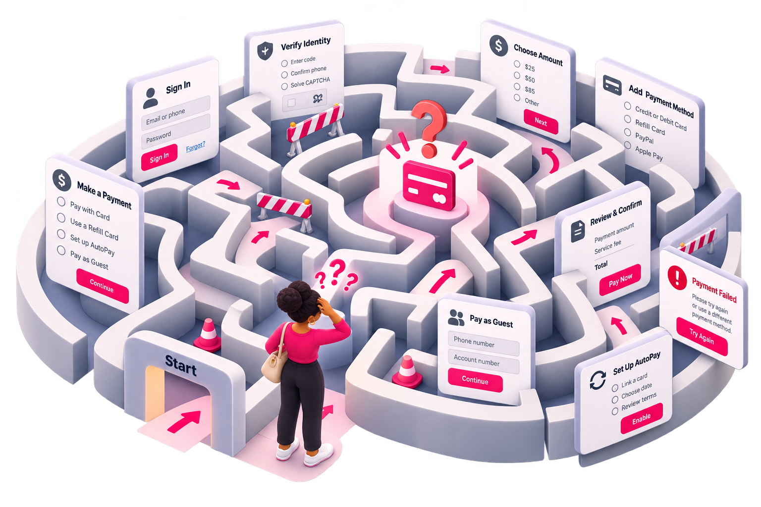
Problem
Prepaid payment options were more complex and siloed compared to the typical checkout.
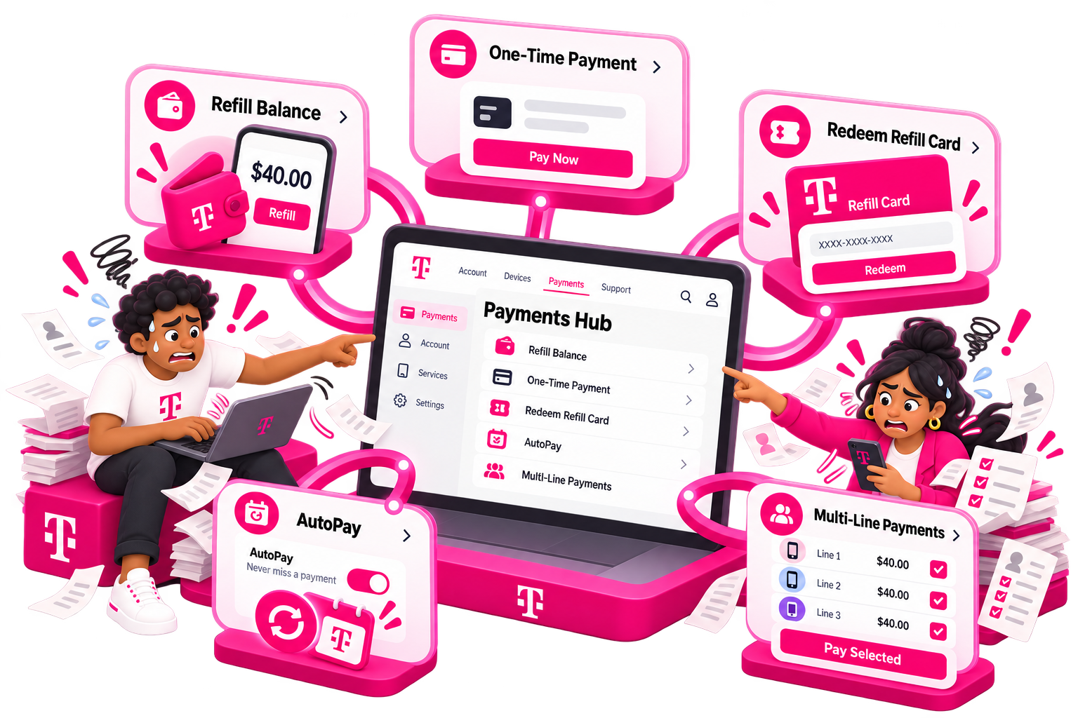
Customers need to refill balances, make one-time payments, redeem refill cards, use AutoPay, and manage payments across multiple lines
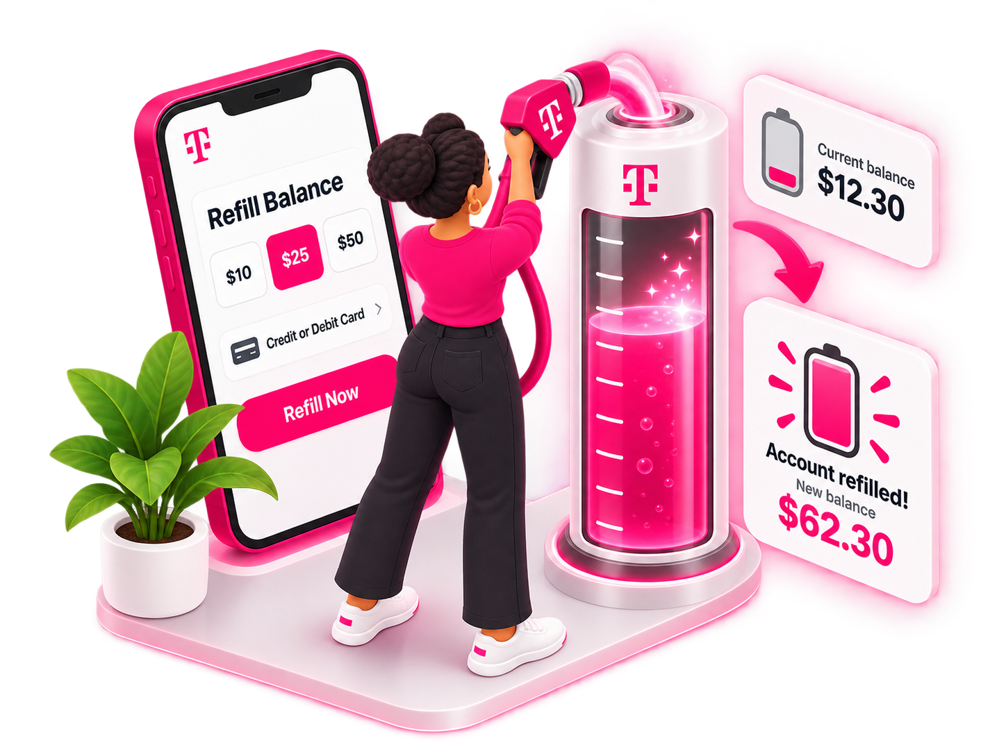
Impact
Payments became less about understanding the mechanics, more about knowing what you owe and what to do next. Customers received clearer guidance for keeping service active, and stronger paths to refills and AutoPay.
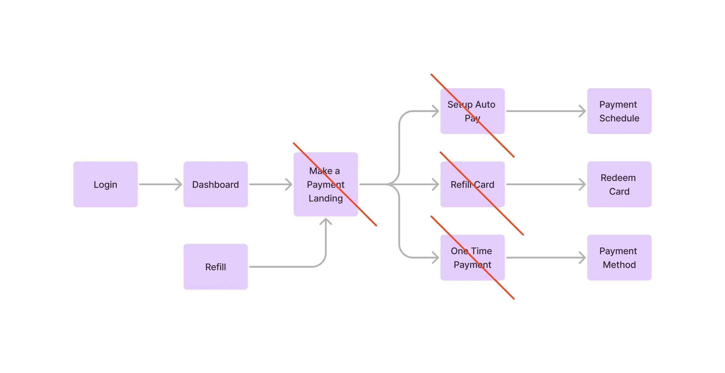
Legacy Payments & Refill
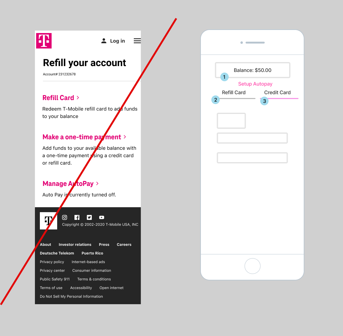
Outdated navigation model that required too many steps and wasn’t compatible with the emerging T-Life app experience.
Strategy:
Consolidate these fragmented paths into a shared payment experience,
Reduce unnecessary navigation,
Reuse the new account components to provide clearer balances, payment guidance, and next actions.
UX Strategy
2 ways to pay, As Guest, Signed In
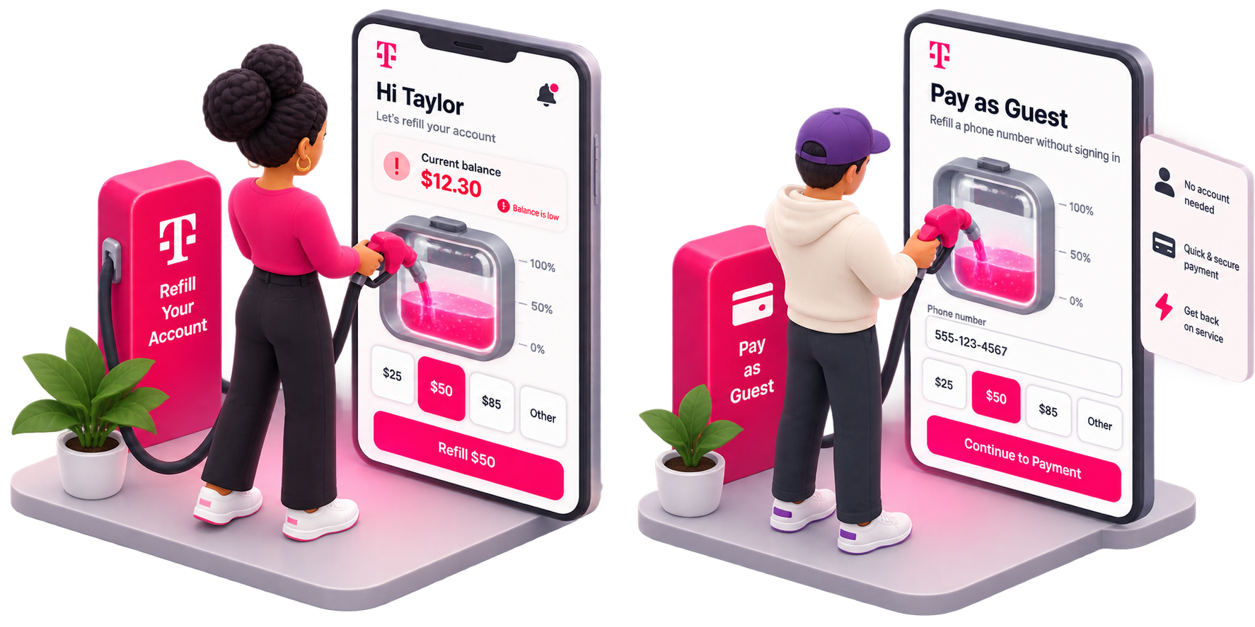
Simplify fragmented options into one place.
A path for signed-in users and guests to make payments more streamlined for different audiences.
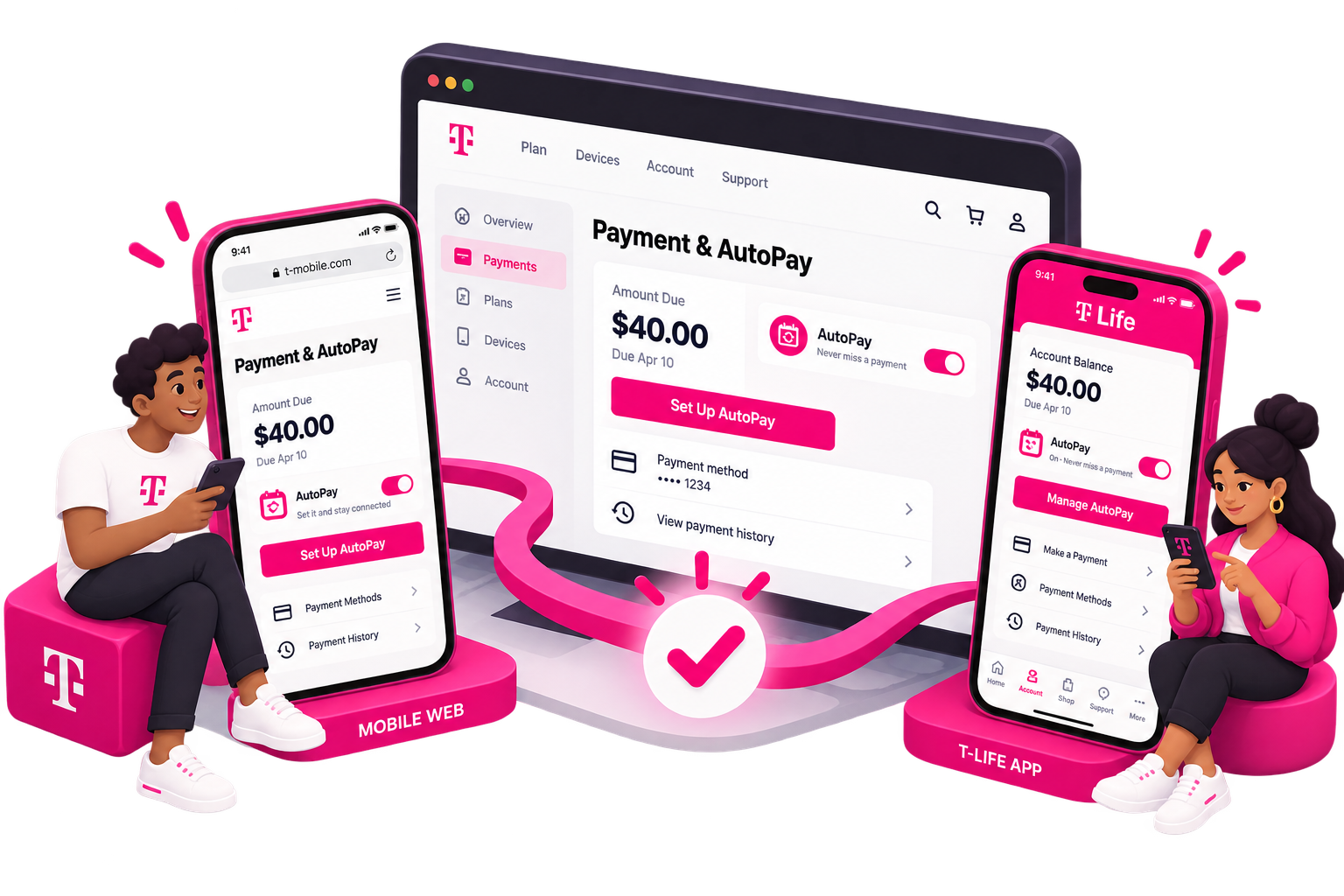
The payment experience had to work seamlessly across T-Life’s native app, mobile web, and desktop, while bringing each touchpoint into the updated design system. I designed reusable patterns so the experience could adapt across screen sizes without changing the underlying payment flow.
Designing One Payment Experience Across Channels
Making Refill Cards Feel Seamless
Introducing CAPTCHA at the right moment was a challenge
Customers could enter their refill card number, complete verification, and immediately see the card’s value before redeeming it.
Making AutoPay Part of the Payment Experience
AutoPay was integrated and promoted within the same payment experience rather than treated as a separate account setting. Customers could see their available balance and renewal amount before choosing between automatic monthly payments or scheduled AutoRefill.
.
Scaling the Experience into T-Life
The new payment patterns and components were designed to scale directly into the T-Life native app, rather than creating a separate mobile experience.
Part 4 - Final - Bring Your Own Device (BYOD)
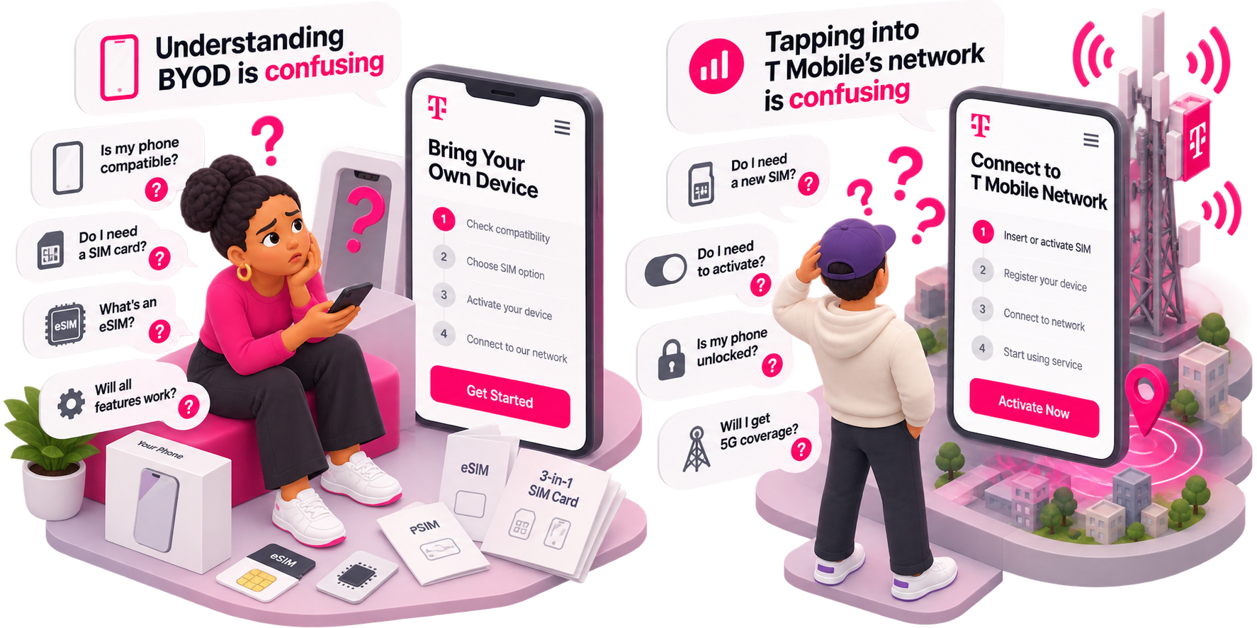
Problem— The legacy BYOD experience put too much responsibility on customers to understand device compatibility,
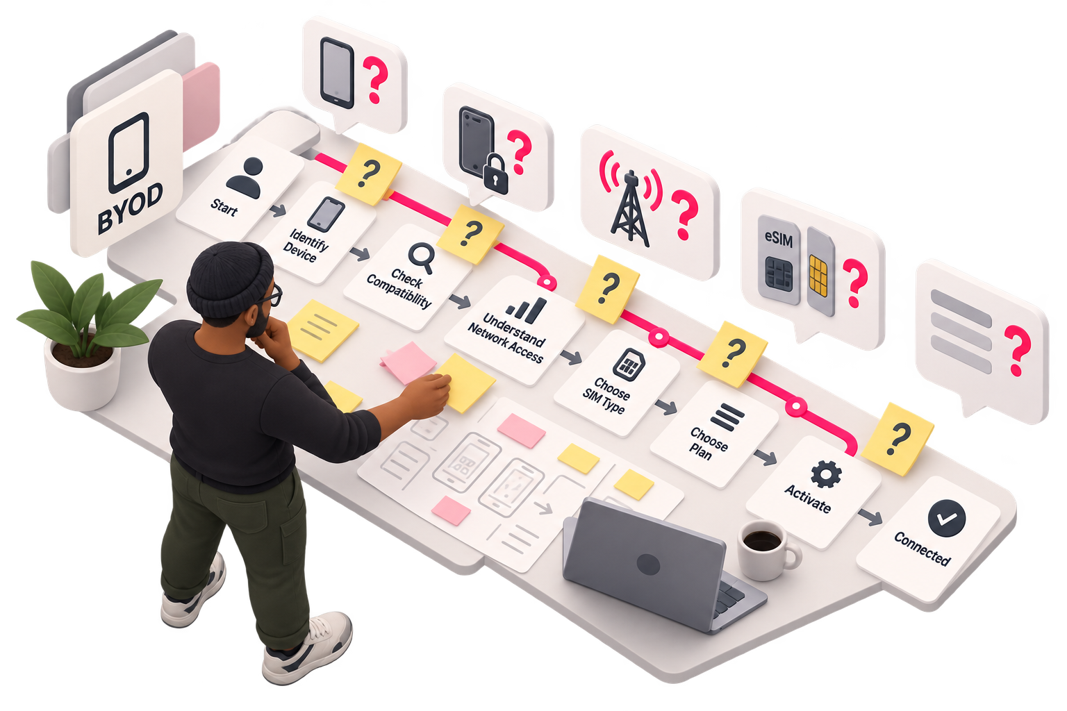
My Role— I mapped the existing experience, identified points of confusion, and worked with Product and Engineering to define a more guided flow.
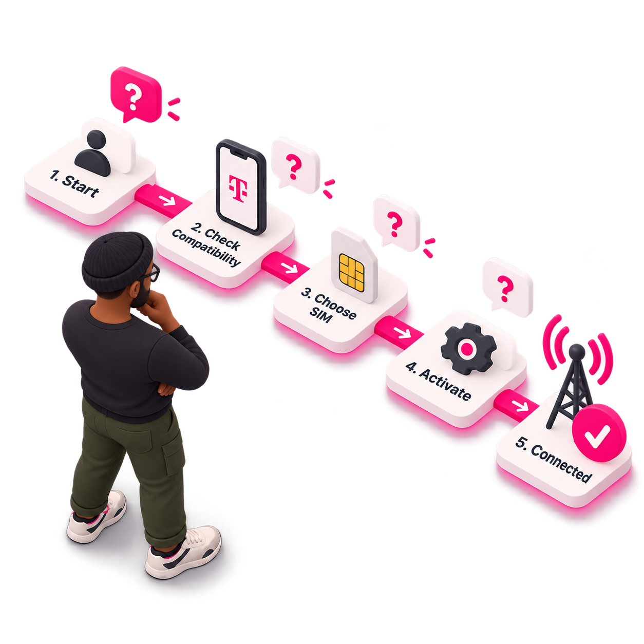
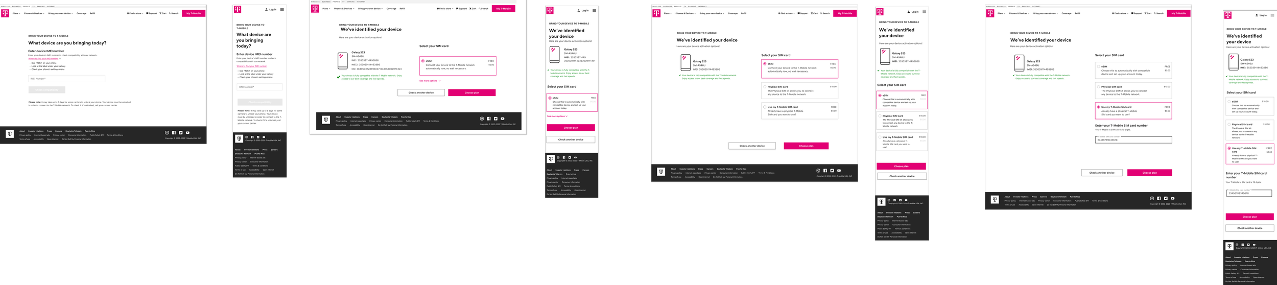
What Changed — I transformed the largely single-page experience into a guided sequence: identify the device → enter IMEI → check compatibility → explain eSIM/physical SIM → recommend the appropriate option → continue to plans.
IMPACT
BYOD became less of a technical utility and more of a guided purchase path. Compatibility results could lead customers directly into relevant plans and activation, connecting a previously isolated tool to the broader prepaid shopping experience.
Heuristics & Opportunities
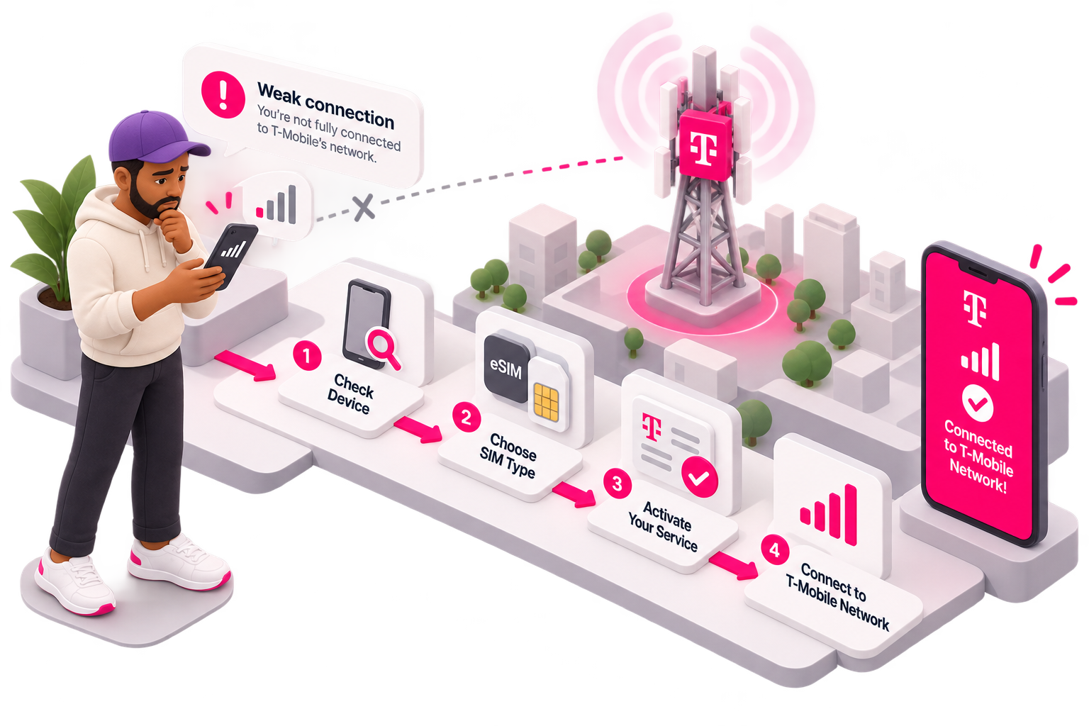
The legacy BYOD experience placed too much responsibility on customers. Dense content, unclear IMEI and SIM guidance, weak system feedback, and blocked paths made a relatively simple task feel technical and uncertain.
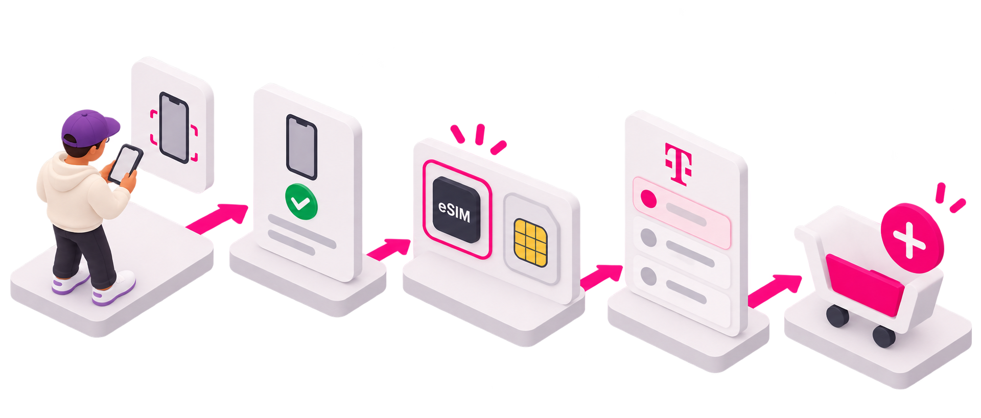
The opportunity was to transform BYOD from a standalone compatibility tool into a guided purchase journey—simplifying the content, clearly explaining IMEI and SIM options, providing immediate compatibility feedback, and always giving customers a relevant next step toward SIM selection, plans, or
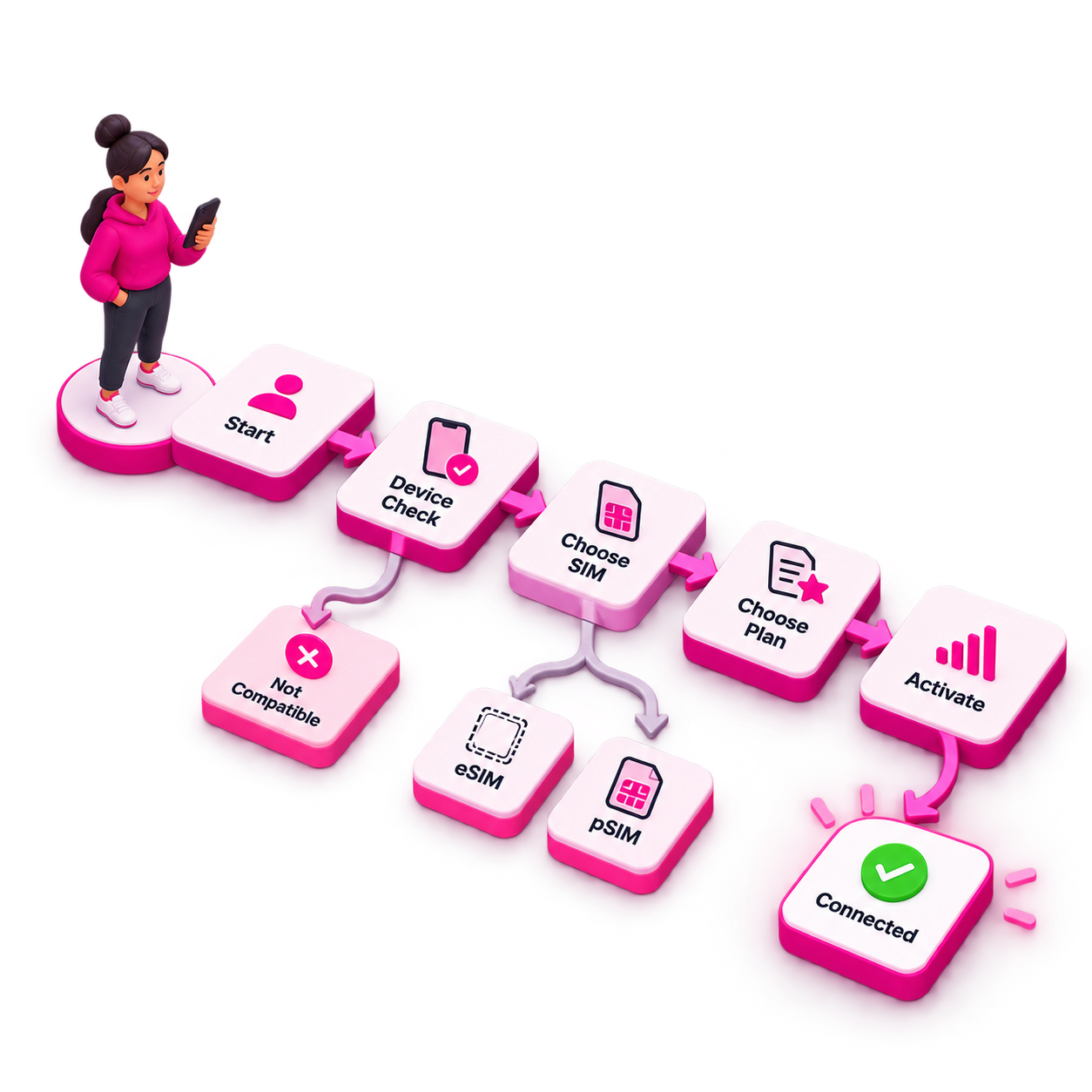
Understanding the System Before Designing It
BYOD introduced a layer of technical complexity. I collaborated closely with QA and Development to map the activation journey and how device compatibility, IMEI checks, eSIM, physical SIM (pSIM), plan selection, and activation actually worked together.
Content Design was part of this discovery process,
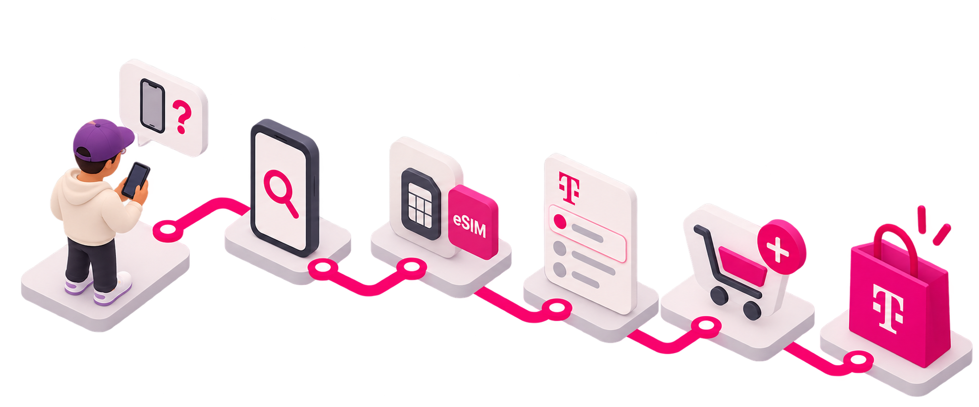
Connecting BYOD to the Purchase Flow
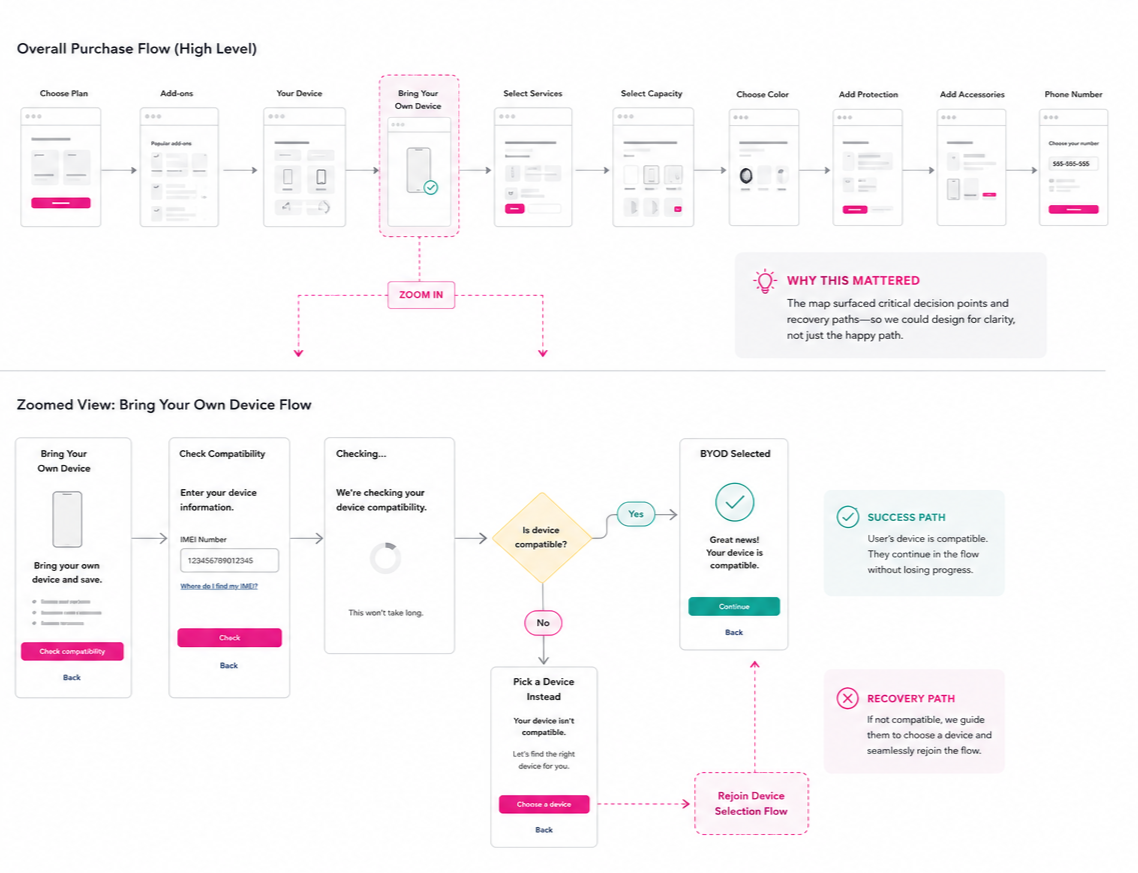
I mapped BYOD into the larger purchase journey to define what happens after the compatibility check. Compatible devices continued directly into the purchase flow, while incompatible devices were guided toward another device and then rejoined the journey without starting over.
This ensured every compatibility result had a clear next step and preserved the customer’s purchase intent.
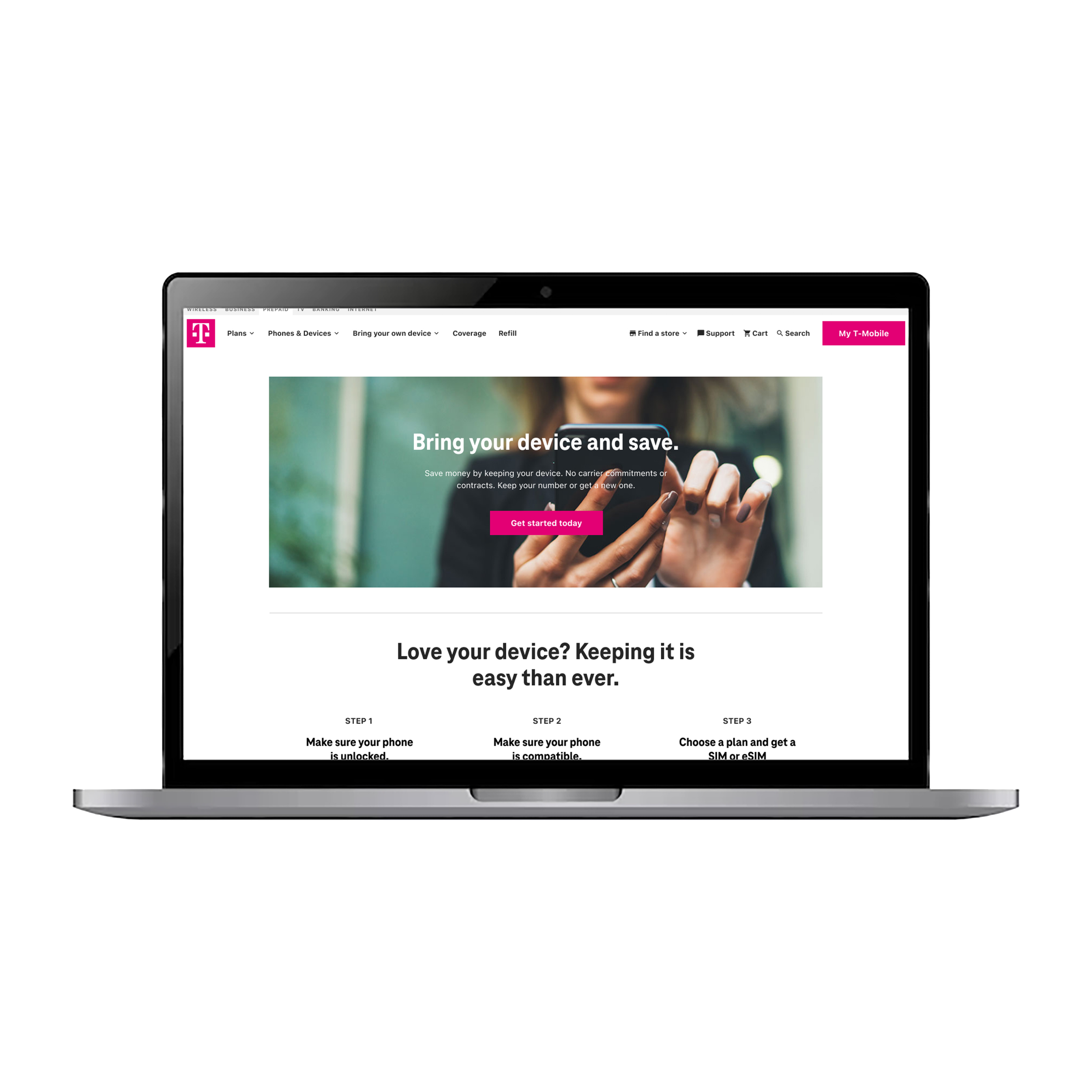
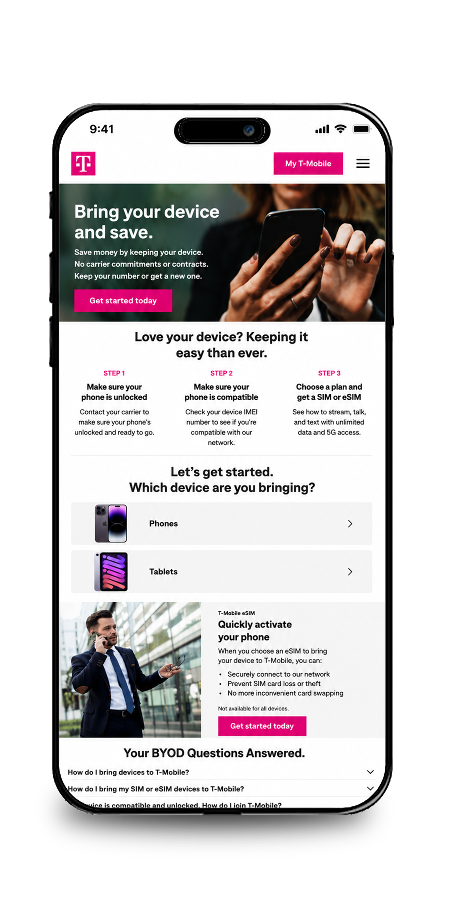
No more one pager flows. Instead, the landing page set expectations upfront and guided customers into a focused, step-by-step flow.
Iterating away from one-page flow designs
Moving from One Page to a Guided Flow
The legacy BYOD experience attempted to handle device compatibility, IMEI checks, SIM education, and next steps on a single page, creating a dense experience with too many decisions competing for attention.
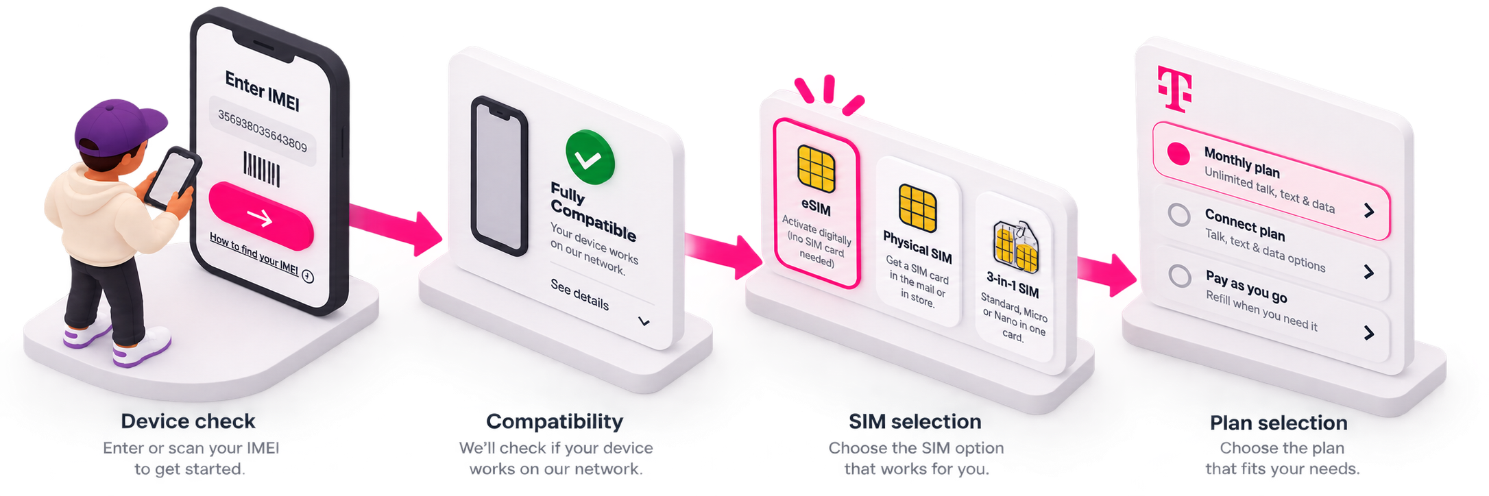
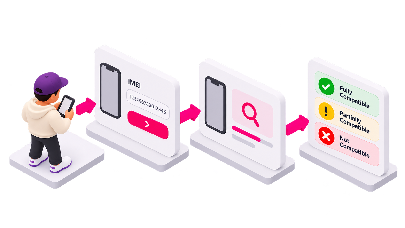
I moved the experience toward a guided, sequential flow consistent with the new purchase journey. Breaking BYOD into focused steps reduced cognitive load, allowed us to provide the right information at the right moment, and gave customers a clear path from device check → compatibility → SIM selection → plan selection.
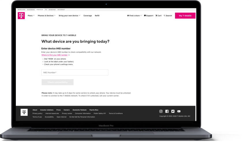
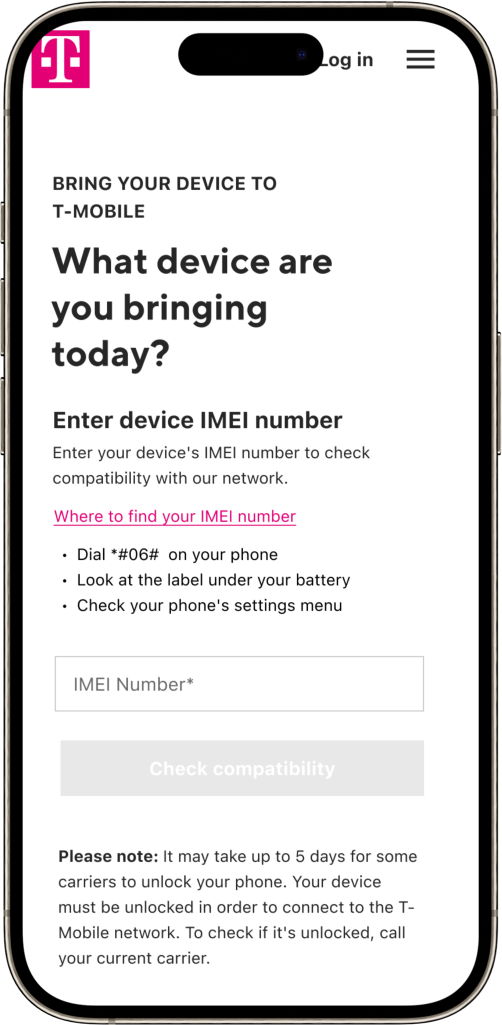
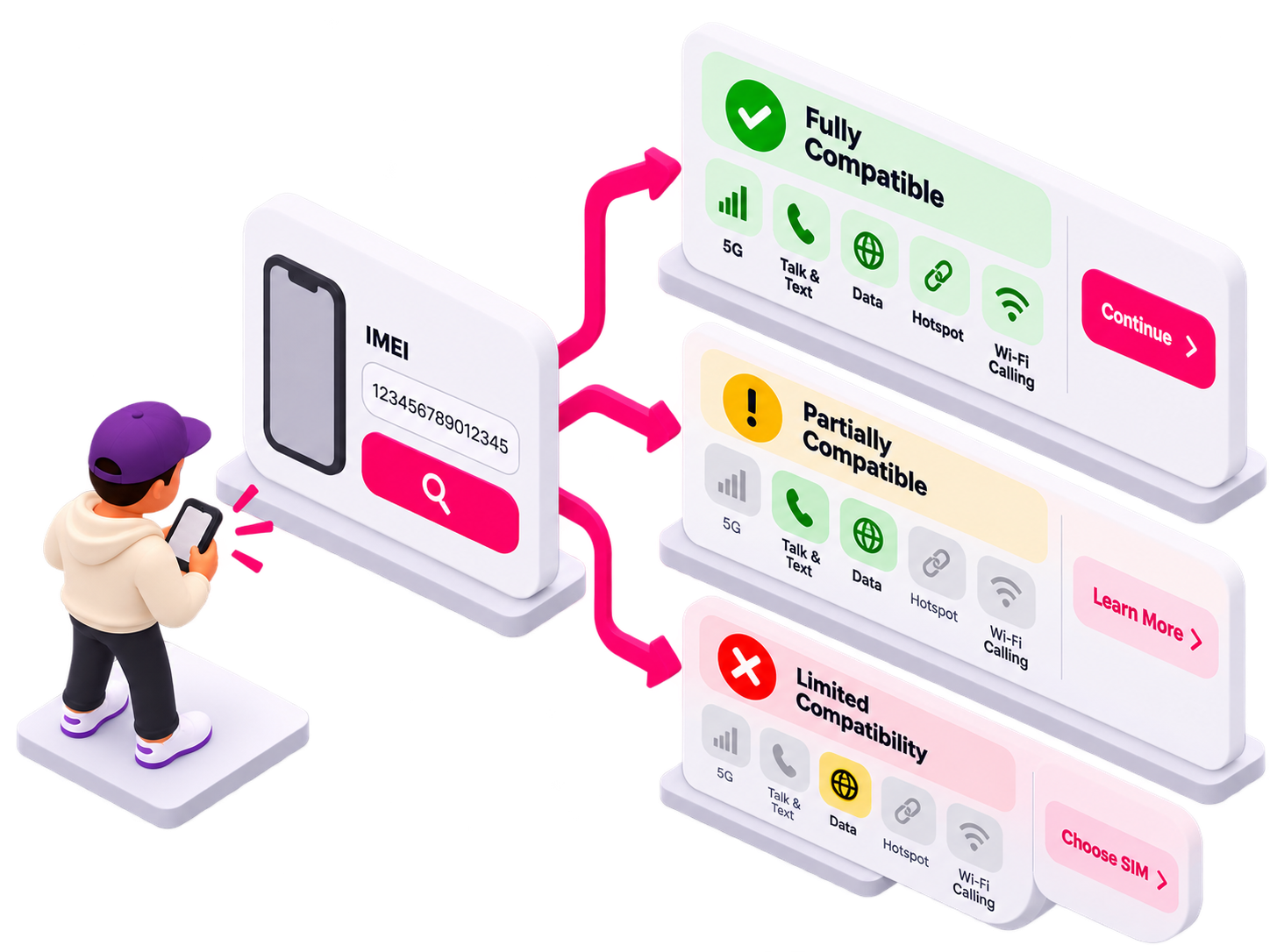
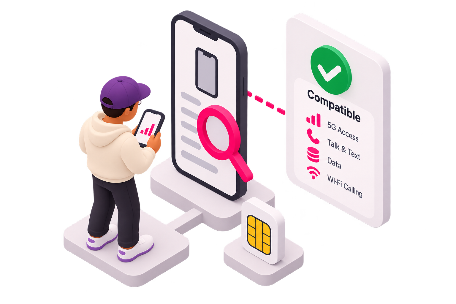
I designed for different levels of device compatibility. For transparency's sake, customers could understand how well their device would perform on the T-Mobile network, what functionality might be limited, and what that meant for their next step.
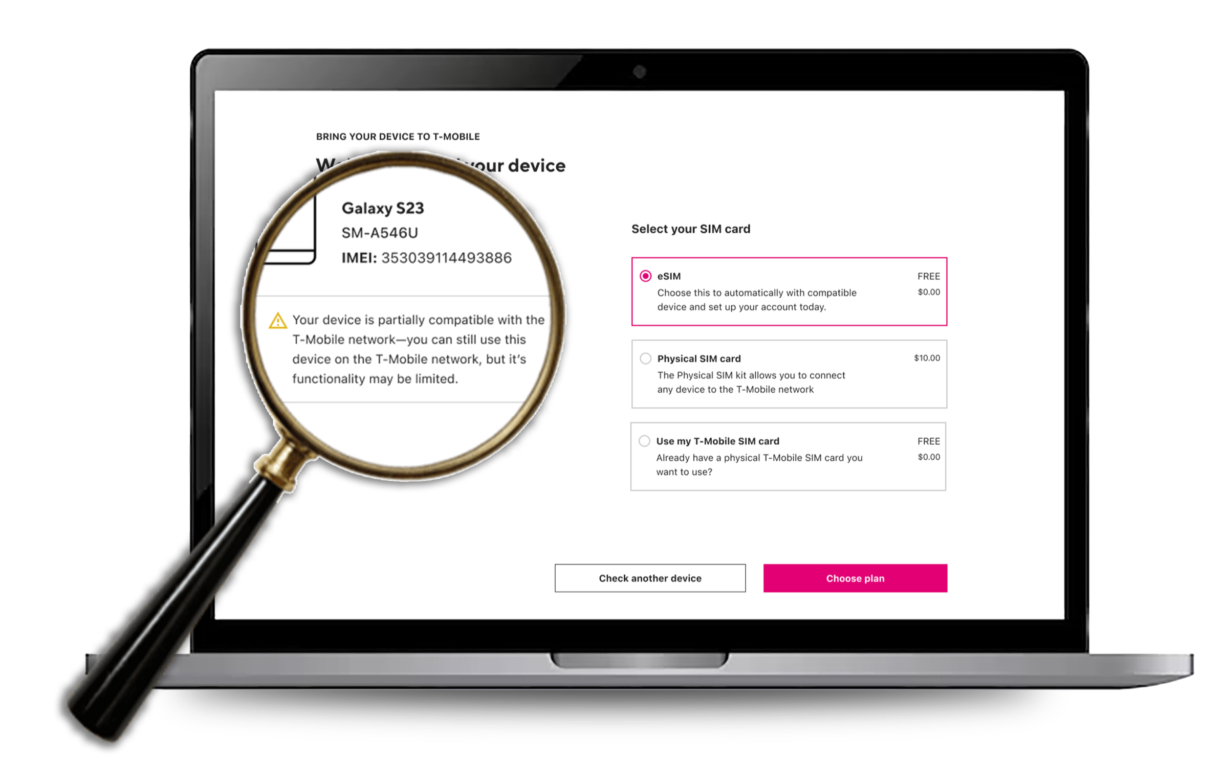
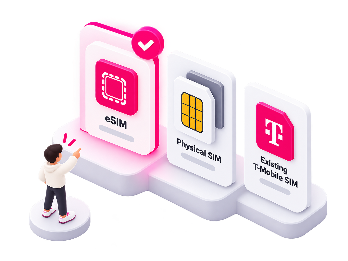
From there, the experience recommended the best SIM option, eSIM, physical SIM, or an existing T-Mobile SIM, based on the device’s capabilities and the customer’s needs, turning a technical compatibility result into a clear path toward choosing a plan and activating service
Putting the Pieces Together

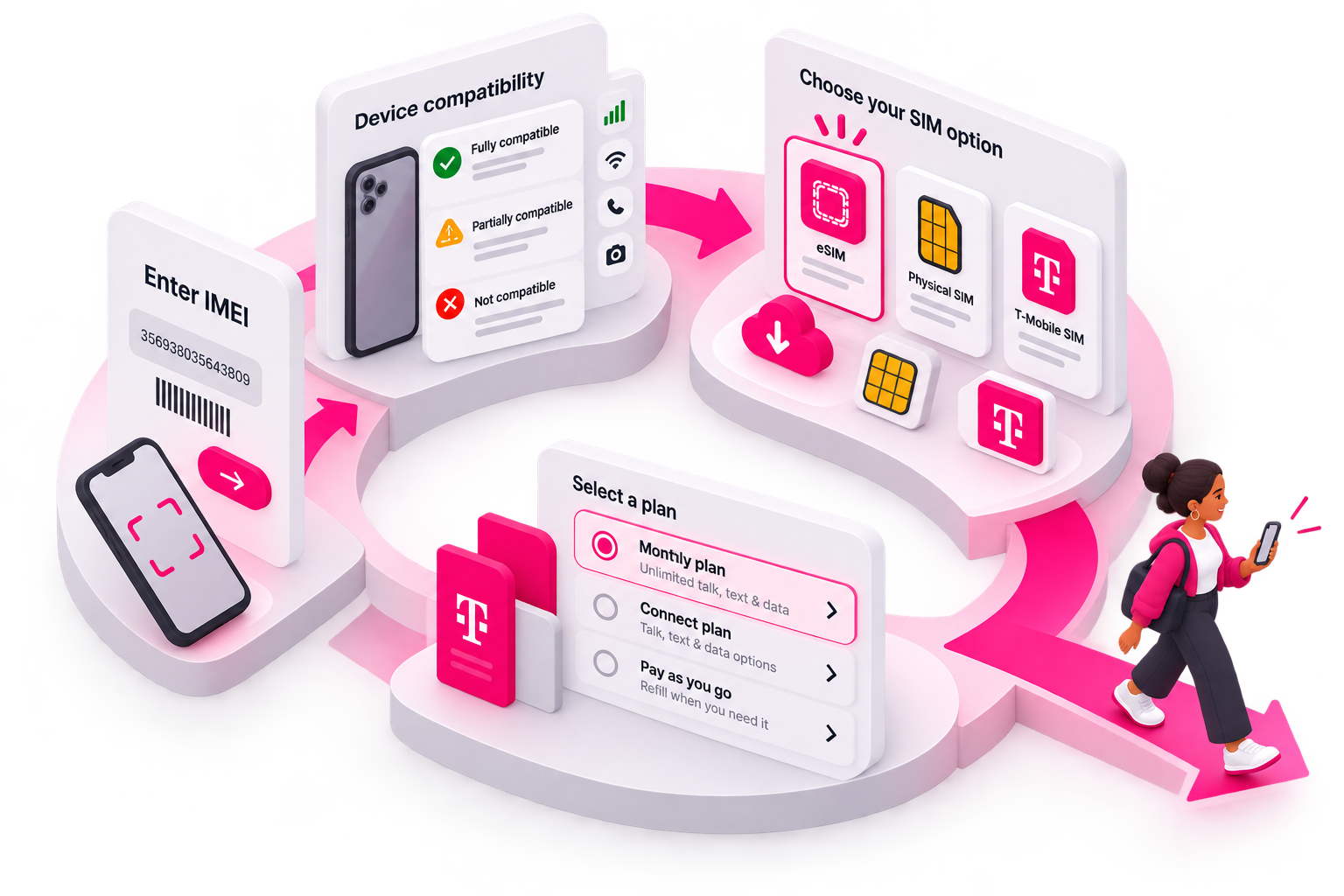
I brought the pieces together into a single flow that accounted for IMEI guidance, compatibility states, SIM options, edge cases, and clear next steps. Mapping each possible outcome helped ensure customers weren’t simply told whether their device worked—they were shown what the result meant and given a clear path forward.
The result turned a technical compatibility check into a guided decision flow that connected naturally to plan selection and activation.
Bringing It All Together
Connect by T-Mobile evolved beyond a series of individual redesigns. Across plan shopping, account management, payments and refills, and BYOD, I worked to create a more connected experience built around the way prepaid customers actually make decisions.
Research established the North Star, while story mapping, competitive analysis, heuristic evaluation, prototyping, and close collaboration with Product, Engineering, Content, QA, and the Design System team helped translate that strategy into shippable experiences.
The result was a simpler, more consistent prepaid ecosystem—one that reduced dead ends, clarified complex decisions, supported web, mobile, and T-Life, and created reusable patterns that could scale as the product evolved.
The biggest takeaway: I wasn’t just redesigning screens. I was connecting fragmented journeys into a system customers could understand and the organization could build on.
Role and Responsibilities: Facilitate the discussion surrounding the purchase path from discovery, design, development, testing, and Release.
Collaboration: Immediate Design team of 3 (part of a larger hub ) includeing ux writers, researchers, project managers , Product Managers, Project Managers, directors, researchers, UX writer, Marketing, Development
Users: T Mobile Prepaid Customers
Tools: Figma, Miro , UX Pin UserZoom