UCLA Health Care Access
Role & Overview: My role was to transition one of these high-traffic campaign pages into an embedded experience within the main UCLAHealth.org website and bring light to the different types of care UCLA Health provides, Virtual, Care Access, and Immediate Care.
Team 2: Designers, Marketing, Webeditor
Tools: FIgma, Drupal, Siteimprove2

Improving Immediate Care Access Through UX Optimization
By reviewing analytics and heatmaps, I gained insight into current user behavior across multiple pages. One of the key findings was that Immediate Care was a top priority—users frequently clicked on links leading to maps and scrolled to find the nearest hospitals.
The previous design had redundant scheduling links that caused confusion, so I used heatmap analysis to identify the most-used elements.
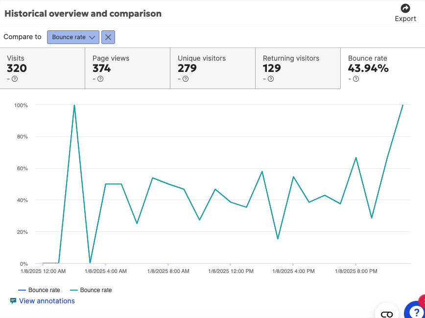
How users currently use the site

Embedded Map for Immediate Access: A quick win was embedding the interactive map directly into the page, reducing the number of clicks needed to find nearby locations
Default Selection of Immediate Care: To reduce friction, we preselected “Immediate Care” by default upon page load.
Location-Based Personalization: We introduced a browser prompt for zip code access, allowing us to deliver nearby options with minimal user input.

Team aligns on ux improvemnts
Prioritized Key Actions: We structured the page to highlight essential options—such as “Book by Phone” and “Virtual Care”—instead of placing all links at the same level. This made the interface more scannable and goal-oriented.
Audience-Specific Language: Clarified pathways for new vs. existing patients to ensure users could quickly identify the relevant action.
On the same page
Competitive Analysis: Positioning UCLA in the Healthcare Landscape
To better understand UCLA Health’s position in the digital healthcare space, I conducted a competitive analysis of key peer institutions, including Cedars-Sinai, Johns Hopkins, Penn Medicine, and Massachusetts General Hospital.
My focus was on examining page layouts, site navigation, and the user flow related to accessing care. I paid close attention to how each organization structured their call-to-action (CTA) elements, and how they differentiated services such as urgent care versus immediate care.
I identified each brand’s value proposition, informing how UCLA could position its digital experience to stand out while meeting core healthcare access needs.
“Establish and maintain consistency across the entire website.”
UCLA Health maintains a rigorous design system based on Drupal widgets, standardized patterns, and brand guidelines. I designed wireframes and layout architectures that aligned closely with these established constraints.
User Flow: Care Access
The Care Access landing page serves as a central hub, guiding users to more granular care options—such as Immediate Care and Virtual Care—so they can choose the path that best fits their needs.

The previous landing page didn’t follow the direction of the org site.
Wireframes: Maps and schedule appoints
The care service pages list available clinics and provide scheduling options tailored to the user’s ZIP code.

Scheduling Appointments through Care Access Pages
Find Immediate Care Near You
The Immediate Care page was designed as the primary entry point before emergency care, offering urgent treatment at the cost of a standard visit. The experience prioritizes location-based access, with an embedded map and familiar scheduling options to help patients quickly find nearby care.
Conclusion
Through a series of targeted redesigns—from Primary and Immediate Care to Video Visit access—I helped streamline UCLA Health’s digital experience with a strong emphasis on clarity, accessibility, and user empowerment. Each design decision was grounded in research, competitive analysis, and collaboration with stakeholders to ensure alignment with both user needs and organizational goals. By bringing consistency to care pathways and surfacing overlooked options like virtual visits, the redesign supports UCLA Health’s broader mission to deliver high-quality, patient-centered care—whether online or in person
Scheduling
I designed the Primary Care landing page to educate users on available care and guide them to the right next step. this includes multiple appointment pathways based on user needs and familiarity with the system. These included:
Scheduling via MyChart for returning patients
Direct call options for immediate assistance
Online scheduling by browsing provider profiles and selecting from available appointment times
This multi-channel approach ensured a more inclusive and accessible experience for both new and existing patients.
Vitual Care
Video visit options were previously scattered across the UCLA Health site, making them easy to overlook. I created a dedicated page to centralize and promote this valuable care option.
The page highlights treatments well-suited for virtual care, such as second opinions, remote monitoring, and e-consults. To prepare users for what to expect, I embedded an explainer video and included links to the MyChart app for additional guidance.
Clear calls-to-action direct users to the portal login, making it easy to schedule a video visit and engage with care from the convenience of home.