OPC IT Portal
IT Equipment Management & Staff Self-Service
Role: Senior Product Designer (Consulting)
Platform: SharePoint, Power Apps, Power Automate, Power BI
Stakeholders: IT Operations, Product Owners, Engineering, Staff, IT Leadership
The Challenge
Turning a fragmented equipment checkout into a self-service experience
OPC's internal IT processes had grown increasingly difficult to manage. Equipment requests, approvals, and tracking were largely handled through email, making it difficult for both employees and IT to understand request status or locate assets.
My Role
I was brought in to assess the existing business processes and design a digital experience that reduced friction for both staff requesting equipment and IT teams responsible for managing the asset lifecycle
Understanding the Business
I met with both staff and IT to understand how work actually happened. Key pain points emerged: Equipment requests were increasing. Most tracking happened through email alerts. Staff had little visibility into request status. IT lacked a centralized way to manage equipment throughout its lifecycle.
Those conversations also revealed that the portal wasn't just about equipment…it also needed to support training, policy acknowledgements, incident reporting, and reporting for IT administrators.
The types of users that will be using the portal. some for checkout, some for maintenance and tracking.
Designing for Multiple Audiences
One of the first discoveries was that this wasn't a single-user experience. The portal needed to support several distinct audiences, each with different goals and permissions.
Staff needed a simple way to request equipment, complete training, acknowledge policies, and report incidents.
IT Administrators needed tools to manage the equipment lifecycle, investigate incidents, and monitor requests.
IT Leadership needed visibility into operations, compliance, and reporting.
Recognizing these different needs early helped shape the information architecture and ensured each experience was tailored to the right audience while remaining part of a unified platform.
Creating a Shared Understanding
“Using visual storytelling for alignment“
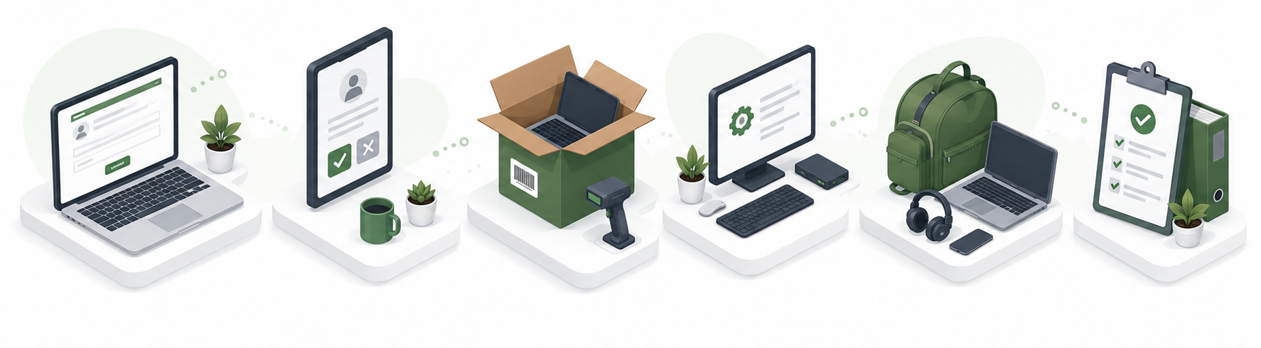
IT and Staff provided a great walkthrough of their process ,To accelerate discovery, I used AI to generate an initial experience map covering the complete employee journeyfrom requesting equipment to training, policy acknowledgements, incident reporting, and asset returns. we used is a point of discussion
AI Acceleration
What traditionally would have taken hours became a discussion-ready artifact in minutes. Instead of replacing design thinking, AI allowed the team to begin conversations with a shared North Star much earlier in the project.
The experience map displays the equipment ordering checkpoints for staff members on a business level. The goal is to take this and make it a self-service experience.
The mental model captures the entire process of equipment used by staff and monitored by IT. This helps break down into sections.
Defining the Core Experience
Working closely with IT Operations, we mapped the complete equipment lifecycle.
The core experience centered around:
Equipment Checkout
Equipment Returns
Incident Reporting
Equipment Availability
Training & Knowledge
Policy & Governance
Once these workflows were understood, the UI became much easier to organize.
Aligning on the Business Process
After meeting with staff and IT, I facilitated a story mapping workshop to visualize the end-to-end experience from equipment requests and approvals to training, policy acknowledgements, incident reporting, and asset returns. The exercise helped Product, IT, and Engineering align on priorities, identify dependencies, and establish an MVP before moving into detailed design.
AI Changes the Design Conversation
Traditionally, I'd begin this phase with hand sketches to align the team around early concepts. For this project, I introduced generative AI as a collaborative ideation tool to accelerate those conversations. Rather than replacing sketching, it helped us quickly visualize ideas, compare directions, and gather feedback earlier.
My role remained the same: facilitating discussions, evaluating ideas, removing scope creep, and shaping concepts into solutions that satisfied both user and business needs. The objective wasn't to produce more screens; it was to reach the right product, faster.
In a short time, plenty of concepts and ideas are generated and compared to assist with ideation.
Working With Development
Development had an established workflow that relied heavily on PDF reviews rather than collaborative Figma boards.
Instead of forcing a different process, I adapted.
I organized the designs into clearly structured Figma sections and produce discussion-ready PDFs whenever needed. As stakeholders became more comfortable with the work, mockups became the center of conversations, making it easier to discuss UI tradeoffs while still supporting the team's preferred workflow.
Design Systems
Guides and Components
Designing Within Constraints
Bringing a distinct product experience to an established enterprise platform
Conceptual UI explorations are great for brainstorming, but the final product has to work within real-world constraints. This experience lived within SharePoint, alongside several other enterprise applications, and needed a distinct identity while still feeling part of the broader organization.
Existing brand guidelines provided the visual foundation, but there was little guidance around reusable components, interaction patterns, or the overall experience. My challenge was to translate the established brand into a practical design system that could work within SharePoint’s capabilities and scale across the portal.
For consistency’s sake, I designed standard typography and table layouts for the information and data the UI would display.
Component Library
Creating an Experience Map and frist round design concepts gave me insight into the patterns and components I needed to plan for, including alerts, confirmations, buttons, status indicators, and plenty of tabular data. To maintain consistency and collaborate more effectively with development, I established a reusable component library upfront, with annotations outlining when and how each pattern should be used.
To validate the process and provide clear feedback, users receive an on-screen confirmation and email notification after submitting a request.
From submitting requests, the wire flow captures how IT can view a list of requests and take actions such as issue, deny, approve.
The wireflow captures the request submission form staff (in blue) and the response from IT (in green)
I designed a table that brings together requests, asset details, and statuses, giving IT the information they need to quickly determine the appropriate action.
I designed an Issue page that allows IT to assign an available asset to the requester, while providing the staff and equipment details needed to confirm the assignment.
Simplifying Equipment Checkout
With standards established, we were level-set on the direction of the design, and the first area in the user journey is Equipment checkout, which became the foundation of the portal. Staff needed a fast, self-service way to request equipment, while IT needed visibility into approvals, availability, and fulfillment.
Working with Product and IT, we simplified the request process into a single guided experience. Instead of navigating multiple emails and approvals, employees could submit requests, track status, and receive updates in one place.
Throughout the design, we balanced employee simplicity with IT's operational needs, giving staff a straightforward request form and flow while providing administrators with the information needed to approve, assign, and manage equipment efficiently.
I explored several iterations of the request page, using AI to rapidly generate and evaluate different approaches, including status bars and large equipment-selection interfaces. Ultimately, the workflow called for something simpler: a focused form with dropdowns and contextual imagery that immediately helped users understand the purpose of the page.
Staff users fill out the Request/Return/Report page. While primarily expected to be used on desktop, it is also responsive users request lapstops, screens monitors, and other assets..
Users receive confirmation of their report, while IT staff are notified by email to review and respond to the incident.
IT can select any equipment item to view its details, including availability, condition, and status, helping them determine whether the asset is appropriate for the request.
Equipment Lifecycle
One of the largest workflows involved equipment assignments. Engineering confirmed Power Apps could support barcode scanning and asset tracking, allowing us to design around capabilities instead of assumptions. Working with IT administrators, we designed a scalable lifecycle covering:
IT could scan assets into the system, receive information and apply the appropriate status to that equipment.
1 Assign 2 Transfer 3 Return 4 Surplus 5 Repair 6 Lost or Stolen
IT Admins wanted to include numerous confirmation pages and status management screens. Rather than increasing complexity, I proposed keeping detailed approval messaging within email while using the portal for action and confirmation only. That kept the experience focused while reducing unnecessary UI
After scanning the equipment, its key information is surfaced directly on the page alongside a list of available actions. Selecting an action opens a contextual drawer where IT can complete the required details and update the asset.
I worked closely with IT to refine these actions and define the appropriate statuses an asset could move through across its lifecycle.
I went through several iterations of the scanned equipment experience, exploring approaches with equipment images, QR Codes, Barcodes, and more visual layouts, photography.
I worked with development to confirm the scanning capabilities and ultimately, IT only needed a simple asset number field and barcode scan for lookup, with key asset information displayed on the left and relevant actions on the right, such as Transfer, Mark Available, Assign, Repair, or Surplus, depending on where the equipment was in its lifecycle.
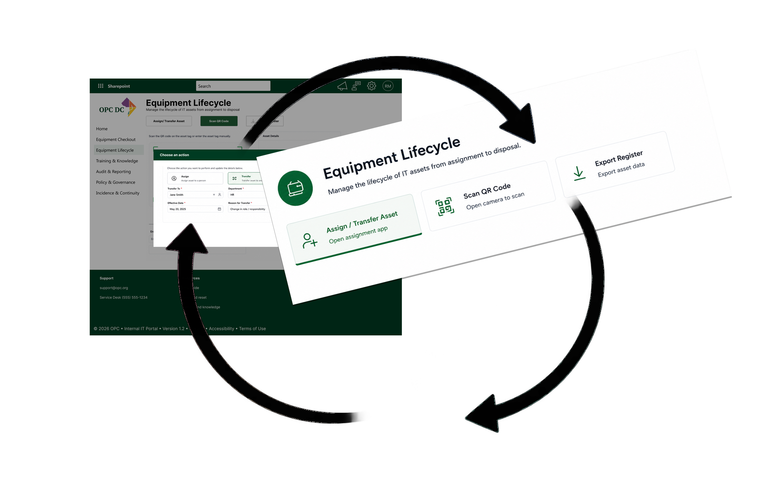
The equipment update is confirmed and reflected with its new status. While IT initially envisioned the page as a live status view that users would continually check, we recognized that requiring users to repeatedly return and scan for updates created unnecessary effort. Instead, status changes would be communicated through email notifications, keeping users informed without requiring them to monitor the portal.
Once the update is confirmed, the change is reflected in the Asset Register with the appropriate status, Now the IT team has a shared, up-to-date view of the equipment lifecycle.
The Wireflow is designed to generate and confirm the equipment check-in and check-out process that utilizes scanning. Once this is confirmed, I move on to more refined designs.
Staff users can look at the backlog of required training and knowledge base articles.
Product Compromise Training & Knowledge
Along with providing equipment for staff, employees also needed training to comply with standards during their employment, which covered how to handle the internet, VPNs, security awareness, etc.
Initially, I proposed richer learning experiences with progress bars and completion tracking.
Engineering confirmed Power Apps could support it. However, maintaining that information would create additional work for IT. Together we decided on a simpler approach. Instead of constantly updating portal status, the system would send reminder emails whenever employees needed to complete required training.
The result reduced administrative effort while still keeping employees informed. Sometimes removing features creates a better product.
Iterations I explored multiple layouts and rounds of the Training & Knowledge experience, including features such as progress bars, completion tracking, and status pills. These patterns were common in the training products I reviewed, but they added complexity without addressing the broader needs of this portal.
I ultimately simplified the experience around finding required training, browsing useful resources, and accessing knowledge quickly. Rather than adding features simply because they were common in learning platforms, I focused on the functionality that supported the actual goals and scope of the project.
The dashboard includes search and filtering to help users quickly find relevant policies. It also displays policy status such as Unread or Acknowledged and provides access to the full policy library for further filtering and exploration.
Why I landed here
The IT view also includes data visualizations that provide a snapshot of policy compliance, such as acknowledgment rates and completion by department. These metrics give IT and leadership a quick way to identify gaps and monitor compliance with government policy requirements.
Policy & Governance
Unlike optional learning, policy acknowledgement was mandatory. Rather than presenting staff with one overwhelming document library, I organized policies into clear categories and simplified acknowledgement workflows. The experience respected government compliance requirements while reducing the effort required from employees.
I designed the Policy & Governance dashboard to surface recently updated policies alongside categories relevant to the user, making it easier to discover, review, and acknowledge the policies that matter to them.
Clicking a policy takes users to the full article, where they can review the content and acknowledge that they’ve read it. Once acknowledged, the policy status is automatically updated, giving both users and IT a clear record of completion.
Quick Change of Plans
Incident & Continuity
We initially explored combining incident reporting and incident management within the same experience. However, mapping the needs of each user group revealed a clear distinction.
Staff members simply needed a quick way to report a problem. They had little reason to see the full incident queue, investigation details, or administrative tools.
IT administrators needed a different level of visibility and control, including the ability to review incidents, assign technicians, track investigations, and access runbooks for common problems.
This led us to separate the experiences. Staff could report an incident directly from the portal homepage or Equipment Checkout, while the Incident & Continuity area became an administrative workspace for IT.
The change reduced unnecessary complexity for staff while giving IT a more focused environment for managing incidents from intake through resolution.
I explored several directions for Incident & Continuity, including a detailed ticket-management view, an analytics-heavy incident dashboard, and a simpler operational list.
I ultimately chose a scannable incident list paired with runbooks and continuity resources. It gave staff and IT immediate visibility into what was happening and what action to take,
Runbooks & Continuity
Problem: Reporting an incident alone didn’t help staff know what to do when a service disruption was already happening.
Solution: I surfaced runbooks and continuity procedures alongside incident reporting, giving users immediate access to established steps for common outages and disruptions.
Problem: IT needed a clear way to understand what had been reported and what required attention.
Solution: I designed a scannable incident list showing status, category, priority, ownership, and recent activity so the team could quickly determine the next action. I used the same table format displaying category and status for tracking.
Impact: Recent incidents are surfaced across the organization, giving IT a shared view of active and recently reported issues. This makes ownership and status more transparent while helping the team recognize recurring problems and broader service disruptions.
Bringing It All Together
The homepage was intentionally designed last. By that point, the core workflows for both Staff and IT were well understood, allowing the most important information to naturally rise to the surface.
Training, equipment requests, inventory, approvals, and required actions were consolidated into a single landing page, giving each audience immediate visibility into what mattered most. The result was a role-aware dashboard that helped users quickly understand what needed attention without digging through multiple sections.
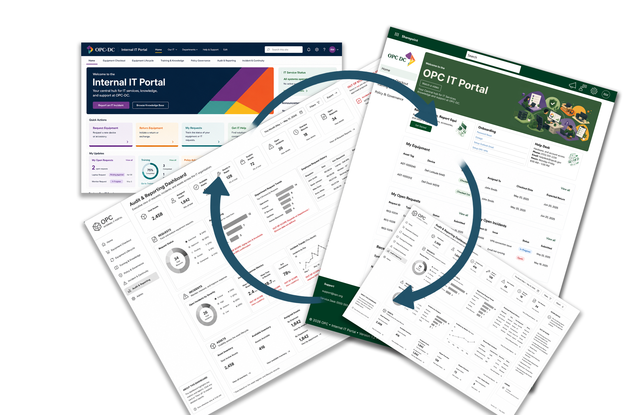
The first set of quick actions connected directly to the core workflows I had already designed, including incident reporting, training and knowledge resources, and equipment requests.
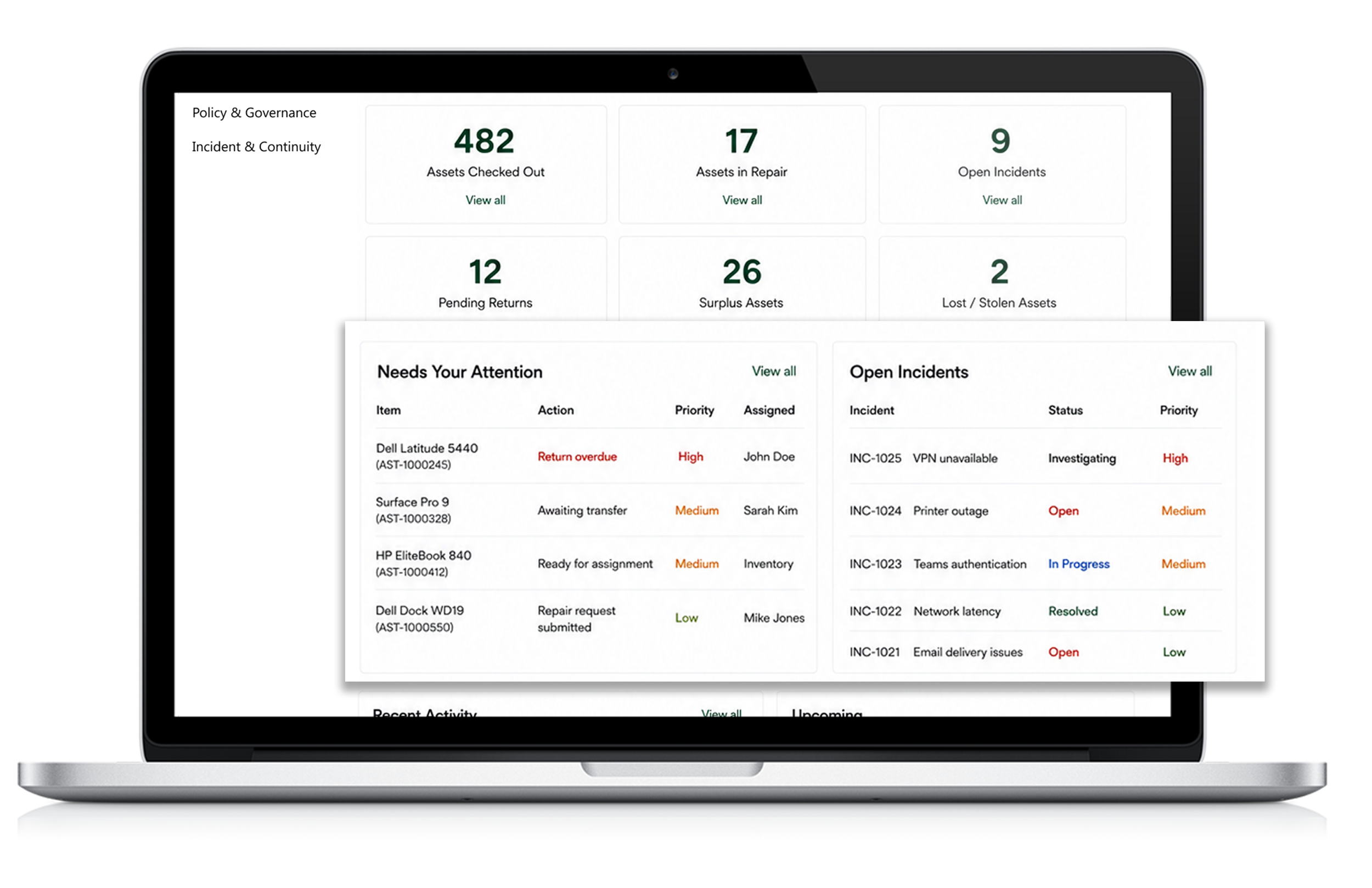
I designed the IT homepage to provide a quick operational overview of equipment status, active incidents, and current checkout activity, giving IT staff immediate visibility into what needs attention.
I explored several homepage concepts, initially leaning heavily on charts, metrics, and dashboard-style content. Through iteration, I realized the homepage needed to feel less like an administrative dashboard and more like a welcoming entry point that helped users quickly understand where to go and what they could do.
I also expanded the homepage beyond the core workflows by introducing quick access to software setup, key IT personnel, announcements, and upcoming events. The broader user journey showed that the portal needed to support more than equipment and incident tasks, helping staff understand what tools are available, who can help, and what is happening across IT.
The homepage also features announcements, platform updates, and timely industry topics, giving staff a reason to return regularly and stay informed about changes that may affect their day-to-day work.
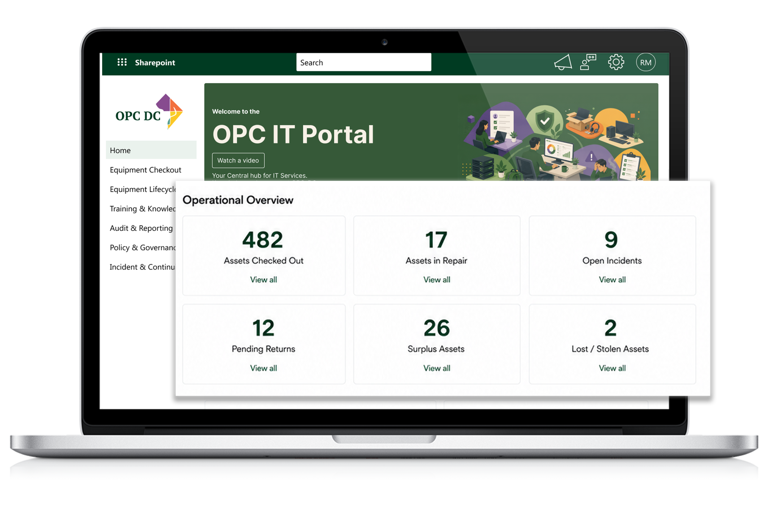
The dashboard also surfaces urgent operational statuses, such as overdue equipment returns and assets awaiting transfer, helping IT quickly identify and resolve items that need immediate attention.
Outcome
The redesigned portal transformed disconnected email-based processes into a centralized self-service platform supporting employees, IT administrators, and leadership.
The project reinforced several lessons:
Understand business processes before designing screens.
Adapt to how teams work instead of forcing new tools.
Use AI to accelerate discovery, not replace design thinking.
Simplify workflows whenever possible.
Different users often need different experiences, even within the same product.