As part of a digital initiative, UCLA Health ran targeted campaigns that directed users to externally hosted landing pages. My role was to transition one of these high-traffic campaign pages into an embedded experience within the main UCLAHealth.org website.
This involved aligning the page design with existing brand guidelines, ensuring visual and functional consistency across the site. I also restructured the content flow to seamlessly connect users with downstream pages, enabling easier access to service information and appointment scheduling tools. The goal was to create a cohesive user journey while improving trust, engagement, and conversion within the UCLA digital ecosystem.
Improving Immediate Care Access Through UX Optimization
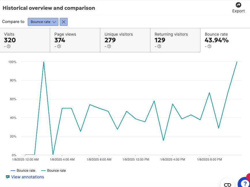
By reviewing analytics and heatmaps, I gained insight into current user behavior across multiple pages. One of the key findings was that Immediate Care was a top priority—users frequently clicked on links leading to maps and scrolled to find the nearest hospitals.
However, in the previous design, many of the appointment and scheduling links pointed to the same destinations, causing confusion and redundancy. To improve this, I conducted a heatmap analysis to identify which elements users interacted with most.
Key UX Improvements:
Consolidated Redundant Links: Streamlined overlapping links to simplify the user journey and reduce decision fatigue.
Prioritized Key Actions: We structured the page to highlight essential options—such as “Book by Phone” and “Virtual Care”—instead of placing all links at the same level. This made the interface more scannable and goal-oriented.
Audience-Specific Language: Clarified pathways for new vs. existing patients to ensure users could quickly identify the relevant action.
Embedded Map for Immediate Access: A quick win was embedding the interactive map directly into the page, reducing the number of clicks needed to find nearby locations.
Surfaced Critical Pages: The “Find Locations” page was previously buried in paragraph text; we elevated it to a prominent position.
Default Selection of Immediate Care: To reduce friction, we preselected “Immediate Care” by default upon page load.
Location-Based Personalization: We introduced a browser prompt for zip code access, allowing us to deliver nearby options with minimal user input.
Competitive Analysis: Positioning UCLA in the Healthcare Landscape
To better understand UCLA Health’s position in the digital healthcare space, I conducted a competitive analysis of key peer institutions, including Cedars-Sinai, Johns Hopkins, Penn Medicine, and Massachusetts General Hospital.
My focus was on examining page layouts, site navigation, and the user flow related to accessing care. I paid close attention to how each organization structured their call-to-action (CTA) elements—particularly those guiding users toward finding care—and how they differentiated services such as urgent care versus immediate care.
I also analyzed how information was prioritized on landing pages, looking at the hierarchy of content such as virtual visits, provider directories, and scheduling tools. This helped me assess how each competitor emphasizes accessibility and user needs.
Additionally, I noted each brand’s unique value proposition, which ranged from "ease of use" to "priority access" and "clinical reputation." These insights informed how UCLA could strategically position its digital presence to stand out while addressing core user expectations in healthcare access.
Fill in the blank here
Loren ipsum
“Whatever it is, the way you tell your story online can make all the difference.”
— Quote Source
Persona
— Quote Source
User Flow mapping out the pathway


