
“Visual concpetual maps helps us understand.”
Bring Your Own Device (BYOD)
Connect by T - Mobile Saga Part 3
Overview:
BYOD Flow: Redesigning for Clarity and Conversion
A substantial portion of T-Mobile’s prepaid customers bring their own unlocked devices to access the network As part of the Digital-First Initiative, it became critical to update the Bring Your Own Device (BYOD) flow to fit into the newly optimized online purchase experience.
Role: UX Designer on a three-person design team within a centralized UX hub supporting the broader organization.
Collaboration: Product Designer, Product Managers, Project Managers, directors, researchers, ux writer, Marketing, Development
Users: T Mobile Prepaid Customers
Tools: Figma, Miro , UX Pin UserZoom
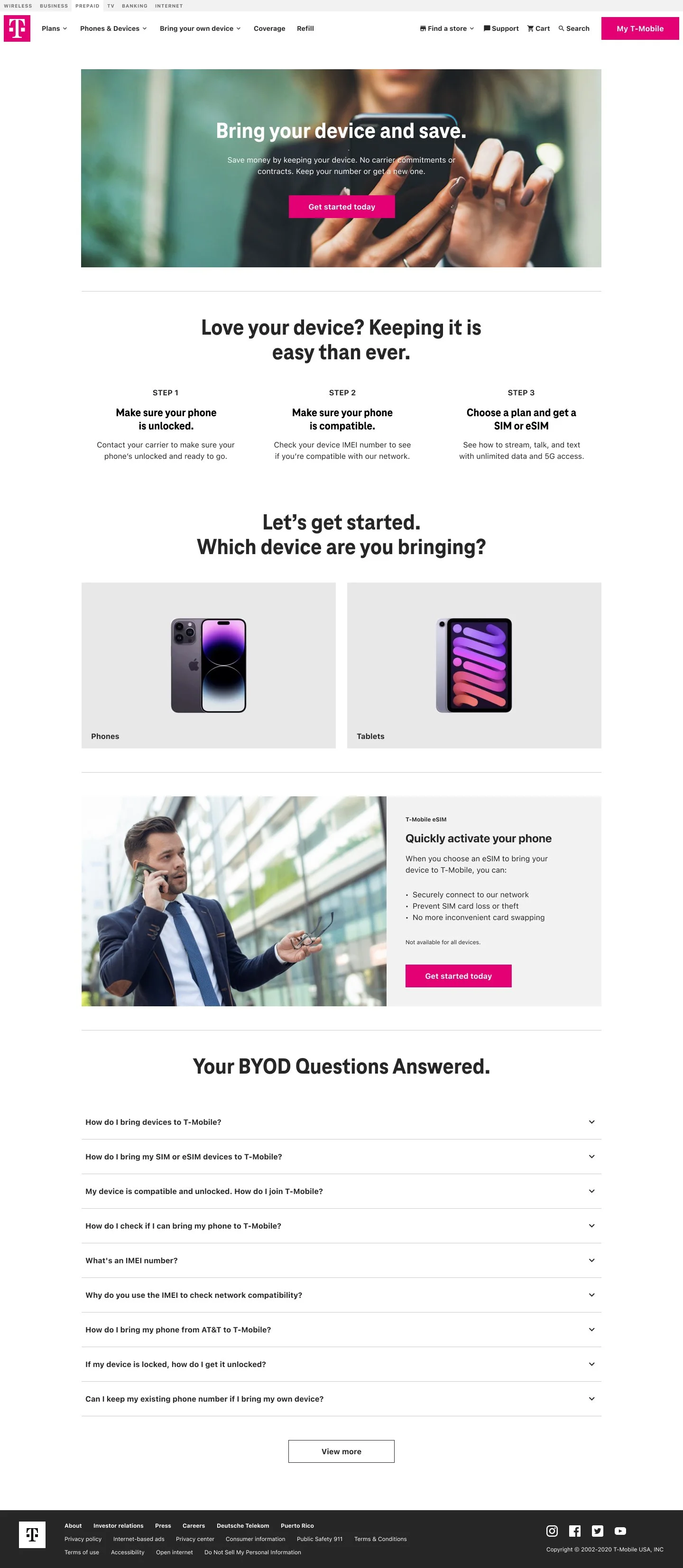
Problem
The legacy BYOD flow was compressed into a single, dense page—likely for development efficiency—resulting in a fragmented user experience. Users were expected to understand technical details about their devices, navigate compatibility questions, and complete the purchase with limited guidance. This created friction, confusion, and drop-off—particularly for users unfamiliar with SIM types, network bands, or device eligibility.
Solution: A Guided, Educational BYOD UXI redesigned the BYOD flow to function as a step-by-step experience, focused on education, clarity, and momentum. The new flow includes:
.
“How to tap into-T Mobiles network with your own device”
How to Connect to the TMO Network | Conceptual Model
To level set with the team I drew a concept model to understand how customers tap into the T Mobile network SIM card to communicate with T Mobile based on the plan of account.
These models help with the content strategy information, the user needs to understand before making a SIM card purchase. what distinguishes an eSIM and pSIM what plans are available based on device compatibility?
An eSIM (embedded SIM) is one that is installed on a chip that is permanently attached to the circuits inside the device. A pSIM (physical SIM) card is a card that is inserted into the device. Unlike a pSIM card, and eSIM does not need to be installed or swapped.— Quote Source
“Lets make sure the phone is compatible with the T- Mobile network”

Phone Compatibility Wireflow
For a better visual representation I used wires to get “buy-in” from more business-oriented stakeholders (regular user flows can make some people zone out)
Based on the type of compatibility users go down different baths and receive certain SIM cards. eSIM, pSIM or both.
“There’s levels to compatibility ”
Based on the type of compatibility users go down different baths and receive certain SIM cards. eSIM, pSIM or both.
Device Compatibility Check
Clearly explains how users can test whether their device works on the T-Mobile network, with links to tools and instructions for entering IMEI numbers.
SIM Card Education
Visual descriptions of different SIM options (physical, eSIM, 3-in-1 kits), explaining what each one does and which is best based on the device type.
Guided Purchase Path
Once compatibility is confirmed, users are guided to select a SIM card, and then moved into the updated All Plans page to complete their plan selection
“Provide compatibility statuses along the purchase path”
With the flow mapped out and following the Mobile-first approach, I designed verticles to map out the flow from entering the IMEI number to selecting the desired sim type.
Because buying a SIM card is not the same as other Phone devices, the goal is to inform and move along.
Inform the user about how to test the network, the status of network compatibility and what types of SIM cards that are available for purchase.
“Different SIM cards based on phone compatibility and needs”
BYOD Desktop, SIM card purchase layout.
The UI warns the user of the different states compatible and what that means before making a purchase. the different benefits of eSIM and pSIM cards, Customers may also have their own SIM card that can be tested as well.

BYOD adds to the T-Mobile Connect purchase experience by giving returning and new customers flexible choice at the point of checkout — letting them activate a plan with their existing device rather than forcing a new device purchase. This reduces friction, honors user investment in their current handset, and strengthens the end-to-end journey from account management into plan selection and conversion.
Why this matters (UX/Business impact)
Reduces friction: Users can skip a device purchase step, which makes the purchase decision easier and faster.
Respects user ownership: Supporting BYOD acknowledges that many customers already own compatible devices — especially relevant for prepaid and budget-conscious users.
Supports continuity: Integrating BYOD into the purchase flow aligns account management with conversion actions, helping returning customers stay within the ecosystem without redundant steps.